


You do not need a spreadsheet wall, a BI seat, or a developer to see your whole operation on one screen. You need a clear question, 7 to 10 numbers that answer it, and a way to keep those numbers live. With Taskade Genesis you describe the dashboard you want, and it builds a working one around your data, the same day. This guide walks the full build, from picking KPIs to publishing a real-time dashboard you own. Build yours with AI or clone a working one to get a head start.
TL;DR: Build an operations dashboard with no code by describing it to Taskade Genesis, picking 7 to 10 KPIs that each answer one question, connecting data through 100+ integrations or a built-in table, then placing tiles and charts with the most important metric top-left. Add AI summaries and anomaly flags, schedule a real-time refresh, and share or publish to your own domain. Minutes to a first version, same day to one you trust. Start free →

What Is a No-Code Operations Dashboard?
A no-code operations dashboard is a single live screen that shows the health of your operation, jobs, revenue, capacity, status, in real time, built by describing it instead of writing code or formulas. In Taskade Genesis the dashboard is a real app, not a static mockup. It reads from connected projects that hold your actual data, so when a job closes or an order lands, the matching tile updates on its own. You build it the way you talk about it: "show me open jobs, on-time rate, and revenue this month," and the app assembles the tables, tiles, and views to match.
The difference from a spreadsheet is that the dashboard does not just display numbers, it sits on top of a working system. AI agents read the same projects and summarize what changed, automations refresh the figures on a schedule, and the whole thing is shareable on your own domain. This is the same backbone behind every app in Run Your Whole Business in One App: connected projects for memory, agents for intelligence, automations for execution.
This is also how an operations dashboard differs from a generic AI app for business. A dashboard is one surface of a larger living system. You can build the dashboard first and let a CRM you build with AI feed its sales tiles, or describe the whole operation at once and treat the dashboard as the screen that watches it.
How Long Does It Take to Build One?
Minutes to a first working dashboard, and usually the same day to one you trust with decisions. The build is not a multi-week BI project. You describe the dashboard, Taskade Genesis generates the tables and tiles, you connect your data, and you refine the layout. Because it is a live app from the first prompt, every edit is immediately usable, there is no separate "deploy" step between building and using it.
| Build stage | What you do | Rough time |
|---|---|---|
| Describe it | Tell Taskade Genesis the audience and the questions | A few minutes |
| Pick KPIs | Choose 7 to 10 metrics that each answer one question | 10 to 20 minutes |
| Connect data | Built-in table or 100+ integrations | 15 to 30 minutes |
| Lay out tiles | Important metric top-left, charts below | 15 to 30 minutes |
| Refresh and share | Schedule updates, share or publish | A few minutes |
The whole build is the same one David, a non-technical operator, runs across a verified cohort of real businesses. None of them hired a developer, and none of them sat through a sales call.
The 8-Step No-Code Dashboard Build
Here is the full walkthrough, the same sequence whether you are building a growth dashboard, a customer-health board, or a field-operations command center. Follow it in order and you end with a live dashboard your team actually opens every morning.
1. Define the Audience and One Question Per Screen
Start with who looks at the dashboard and the single question they need answered. A founder asks "are we growing?" An ops lead asks "what is behind today?" A support manager asks "are customers happy?" Each of those is one screen. The fastest way to build a cluttered, ignored dashboard is to answer five questions on one screen, so write the one question down first and let it govern every tile you add. If a tile does not help answer that question, it belongs on a different screen.
2. Pick 7 to 10 KPIs
Choose 7 to 10 metrics, no more, where each one answers a piece of the screen's question. Fewer than seven and the dashboard is too thin to act on, more than ten and it stops being scannable. The table below shows a starter KPI set per dashboard type, so you can pick a row and adapt it.
| Dashboard | Core KPIs to consider |
|---|---|
| Growth / revenue | MRR, new signups, conversion rate, churn, revenue this month, active users |
| Field operations | Open jobs, on-time rate, jobs completed today, backlog, crew utilization, cost variance |
| Customer health | Health score, open tickets, response time, CSAT, at-risk accounts, renewals due |
| Sales pipeline | Leads this week, deals in stage, win rate, average deal size, revenue closed, follow-ups due |
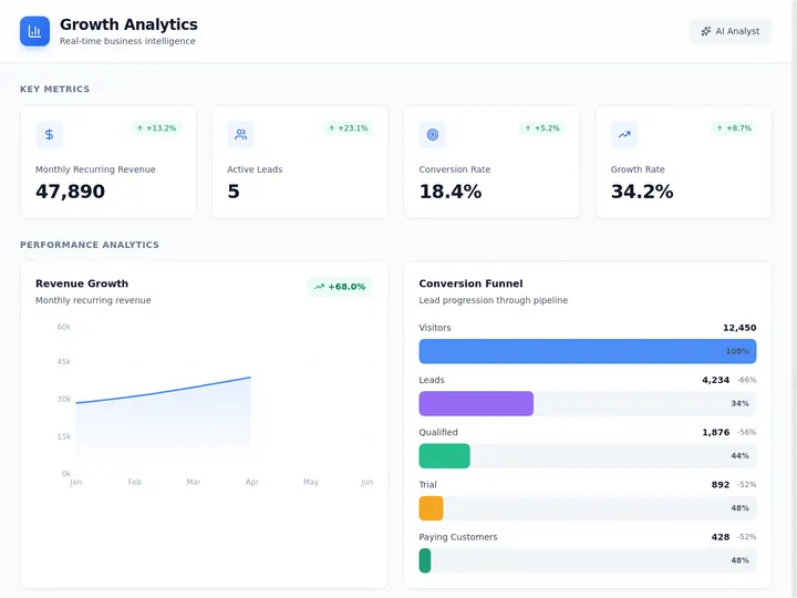
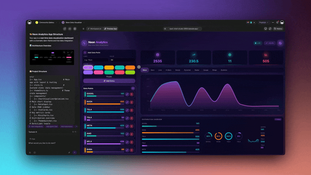
The Growth dashboard above is a live app you can clone in one click, point at your numbers, and run. It is a good template for the "are we growing?" screen.
Different teams watch different numbers, so the starting KPI set depends on who opens the dashboard. The table below maps a core KPI set to four common teams, so you can hand the right screen to the right person instead of building one cluttered board for everyone.
| Team | KPIs they act on | One question it answers |
|---|---|---|
| Sales | Leads this week, deals by stage, win rate, revenue closed | Is the pipeline healthy? |
| Operations | Open jobs, on-time rate, backlog, crew utilization | What is behind today? |
| Finance | Revenue this month, cash position, overdue invoices, burn | Are we on plan? |
| Support | Open tickets, first-response time, CSAT, at-risk accounts | Are customers happy? |
When you are unsure whether a metric earns a tile, run it through one test: does it change a decision? A KPI selection box keeps the screen honest.
  ┌──────────────────────────────────────────────────┐
  │  KPI SELECTION TEST  (run on every candidate tile) │
  ├──────────────────────────────────────────────────┤
  │  Does this number answer the screen's question?    │
  │        no  ──────────────►  different screen        │
  │        yes ──────────────►  next check              │
  │                                                    │
  │  If it moved, would someone DO something today?     │
  │        no  ──────────────►  vanity metric, cut it   │
  │        yes ──────────────►  next check              │
  │                                                    │
  │  Is it already in the top 7-10 for this screen?     │
  │        yes ──────────────►  demote a weaker tile    │
  │        no  ──────────────►  KEEP as a tile          │
  └──────────────────────────────────────────────────┘
3. Connect Your Data
Feed the dashboard real data through a built-in relational table, 100+ bidirectional integrations, or both. The built-in Table view gives you a spreadsheet-grade grid that lives inside the same app as the dashboard, so there is no second tool to sync. For tools you already run, integrations pull events in: Stripe payments, Gmail leads, Calendar bookings, Slack alerts. The full mechanics of the relational backbone are in Tables and Databases in Taskade. Connect data once, and every tile that reads from it stays current.
A common mistake here is to over-connect. Wire in only the sources that feed your 7 to 10 KPIs. Everything else is noise that slows the refresh and clutters the build.
The flowchart below shows how scattered tools converge into one dashboard. Each source connects once through an integration, lands in the connected projects that act as the data layer, and surfaces as the tile that reads it.
4. Place Tiles and Charts
Turn each KPI into a tile or chart on the dashboard surface. A number that should jump out (revenue, on-time rate) becomes a big-number tile. A trend (signups over time, backlog by week) becomes a line or bar chart. A breakdown (jobs by status, deals by stage) becomes a board or grouped table. Taskade Genesis gives you 7 project views to use as dashboard surfaces, so the same data renders the way each KPI reads best.
| Project view | Best for on a dashboard |
|---|---|
| Table | KPI grids, sortable records, the data layer behind tiles |
| Board | Status breakdowns (jobs by stage, tickets by priority) |
| Calendar | Bookings, due dates, scheduled work |
| Gantt | Project timelines and dependencies (Timeline lives inside Gantt) |
| Mind Map | Relationships between accounts, owners, and deals |
| List | Follow-up queues and action items |
| Org Chart | Team and reporting structure for capacity views |
5. Lay Out Important-Top-Left
Place the single most important metric in the top-left tile, because that is where the eye lands first on every screen. Then arrange the rest in a rough priority order, left to right, top to bottom, with secondary detail below the fold. The screen should read like a sentence: the headline number first, the supporting numbers next, the deep cuts last. A dashboard that opens with the metric a decision depends on gets opened every day. One that buries it three tiles down gets ignored.
The wireframe below shows the layout grammar. Anchor the screen's headline KPI top-left, set supporting numbers in a row beside it, drop the trend chart across the middle, and keep breakdowns and the deep cuts below the fold.
  ┌─────────────────────────────────────────────────────────┐
  │  ████████████   ┌────────┐ ┌────────┐ ┌────────┐         │
  │  ████████████   │  KPI 2 │ │  KPI 3 │ │  KPI 4 │   row of │
  │  HEADLINE KPI   │ support│ │ support│ │ support│  support │
  │  (top-left)     └────────┘ └────────┘ └────────┘  numbers │
  ├─────────────────────────────────────────────────────────┤
  │  ╱╲    ╱╲                                                 │
  │ ╱  ╲  ╱  ╲   TREND CHART (line over time / bar compare)   │
  │╱    ╲╱    ╲                                               │
  ├──────────────────────────  fold  ───────────────────────┤
  │  ┌─────────┐  ┌─────────┐                                 │
  │  │ Board   │  │ Table   │    breakdowns + deep cuts        │
  │  │ by stage│  │ records │    (below the fold)             │
  │  └─────────┘  └─────────┘                                 │
  └─────────────────────────────────────────────────────────┘
The layout method is really a small state machine: one question governs the screen, the headline KPI anchors it, and every other tile either supports that question or moves to its own screen. The diagram below is the loop you walk for each tile you consider adding.
6. Turn On Real-Time Refresh
Keep the numbers live with two kinds of automation. Scheduled automations recompute the dashboard on an interval you set, every 15 minutes, hourly, each morning, using scheduled automations. Trigger-based automations update a tile the instant an event fires, a new order, a closed deal, a finished job, using automation triggers. The sequence below shows how a live event reaches the right tile without anyone touching the dashboard.
Match the Refresh Cadence to the Decision, Not the Hype
Real-time everywhere is the most common operations dashboard mistake. It costs more, breaks more often, and most of the time nobody is watching the screen in the second it updates. The better rule is to match the refresh cadence to the decision the tile drives. Before you make a tile live, write down the decision someone makes in that shorter latency window. If there is no decision, a scheduled refresh is enough.
| Tile type | Refresh cadence | Why |
|---|---|---|
| Support queue, live job status | Near real-time trigger | A team acts on it within the same shift |
| Today's bookings, open orders | Hourly schedule | Decisions happen across the day, not the second |
| Revenue this month, executive recap | Daily schedule | Nobody acts on a one-minute revenue change |
| Anomaly alert (churn spike, SLA breach) | Trigger, alert-first | Page the team, do not ask them to watch a chart |
Two practical habits keep trust high. Show a last-updated timestamp on each tile so a viewer knows whether the number is two seconds or two hours old. And lean on the alert-first pattern for anything urgent: instead of asking a human to stare at a tile, let a notify-on-threshold automation page them the moment a line is crossed. The whole point of a no-code dashboard is that it watches itself.
7. Make It Work on Desktop and Mobile
The same dashboard works on desktop and mobile out of the box, so you do not build or maintain a second version. A manager reviews KPIs on a laptop, and a field crew checks the same live numbers on a phone between jobs. The responsive layout comes from the app itself, your job is just to make sure the top-left metric and the most-used tiles read cleanly on a small screen.
8. Share or Publish
Share the dashboard with a view-only or editable link in seconds, or publish it to your own custom domain with branded logins. Custom domains and App Users (branded sign-in) unlock on Business and above. The walkthrough for team and client access is in Account and Workspace settings. Once published, each viewer signs in to a private space and sees only the data meant for them.

The Customer Health dashboard above is the "are customers happy?" screen, clone it and point it at your accounts.
The AI Layer: Summaries, Anomaly Flags, and Ask-AI
The biggest difference between a no-code dashboard and a spreadsheet is the AI layer on top of the numbers. In Taskade Genesis, AI agents read the same connected projects the tiles display and do three things a static chart cannot.
- Auto-summaries. The agent writes a plain-language recap of what changed since yesterday, so the dashboard reads itself: "Revenue is up 8 percent, two jobs slipped past their due date, the support backlog cleared."
- Anomaly flags. The agent watches the KPIs and flags a metric that jumped, stalled, or crossed a threshold, before a human notices. A spike in churn or a stalled pipeline surfaces as an alert, not a number you have to catch yourself.
- Ask-AI for insights. You type a question in plain language, "which region is behind plan this week?" or "what is driving the support backlog?", and the agent answers from the live data, because it reads the same projects the tiles do.
What makes those three things possible is the agent's toolset. A Taskade Genesis agent ships with 34 built-in tools, so the analyst on top of your dashboard is not a chat box that only talks. It can run a web search to pull an external benchmark next to your number, analyze a file you drop in, run code to recompute a metric, and keep persistent memory of what it flagged last week so the Monday summary references the Friday anomaly. For a board that spans several screens, multiple agents can collaborate, one owns the sales summary, another watches operations, and they hand off findings.
Agents in Taskade Genesis run on 15+ frontier models from OpenAI, Anthropic, Google, and open-weight providers, with an Auto setting that routes each task to a sensible default. You can switch the model per agent when a heavier summary needs a stronger model, or leave the whole board on Auto and never think about it. The full agent build is in Build an Internal Tool Without Code, where the agent becomes the analyst sitting on top of the dashboard.
Automations and 100+ Integrations
Automations are what keep the dashboard live without anyone touching it, and integrations are what feed it real-world data. The two work together: a trigger pulls an event in, and an action pushes a result back out, all across 100+ bidirectional integrations.
Two automations cover most dashboards. A scheduled refresh recomputes KPIs on an interval (see scheduled automations). A notify-on-event automation pings Slack or email the moment a metric crosses a line, so the team learns about a problem from the dashboard instead of from an angry customer. The pattern of setting these up once and letting them run is the whole story of Set It Once, Run It Forever.
Publish to Your Own Domain
When the dashboard graduates from internal tool to something clients or stakeholders see, publish it to your own custom domain with branded sign-in. Custom domains and App Users (GenesisAuth logins) unlock on Business and above. You clone or build the dashboard, edit it, hit publish, and it is live at your-domain.com with authenticated logins and per-viewer privacy. Each App User signs in to a private space, so a client sees only the metrics meant for them and never another viewer's data. The role-based access runs across seven permission levels from Owner to Viewer, so an exec sees the full board while a contractor sees one tile.
Common Mistakes to Avoid
Most dashboards fail for the same handful of reasons. Avoid these and yours stays useful past week one.
| Mistake | Why it hurts | The fix |
|---|---|---|
| Answering five questions on one screen | Nobody can find the number that matters | One question per screen, split the rest |
| More than 10 KPIs | The screen stops being scannable | Cut to 7 to 10, demote the rest below the fold |
| Burying the headline metric | The dashboard gets ignored | Most important KPI in the top-left tile |
| Manual data entry | The numbers go stale, trust erodes | Connect a table or integration, schedule a refresh |
| No alerts | You learn about problems too late | Add a notify-on-event automation |
| Vanity metrics | Pretty numbers nobody acts on | Every KPI should change a decision |
How a No-Code Dashboard Compares to the Old Way
The point of building this way is that the dashboard is an app that acts, not a chart you maintain. The table below is the before-and-after.
| The work | Old way (spreadsheet + BI tool) | No-code in Taskade Genesis |
|---|---|---|
| Build it | Formulas, charts, or a developer | Describe it in plain language |
| Keep it current | Manual exports and pasting | Scheduled and trigger automations |
| Get insight | Read the chart yourself | AI summaries, anomaly flags, ask-AI |
| Share it | Export a PDF or screenshot | Live link or your own domain |
| Cost | Per-seat BI licenses | Flat plan, free to start |
This is the same shift behind Build a Business App Without Code: you stop maintaining a tool and start running an app that works the data for you. For a CRM that feeds the sales tiles on your dashboard, see the CRM, Invoice Generator, Client Portal drop, and for the data-and-payments backbone underneath it all, Memory, Workflows, Payments.
Clone a Working Dashboard and Make It Yours
The fastest way to a dashboard you trust is to start from one that already runs. Every dashboard on this page is a live app you can clone in one click, point at your data, and reshape. Browse hundreds more in the Community Gallery, then build your own.
| Live dashboard | What it answers | Clone it |
|---|---|---|
| Growth dashboard | Are we growing? | Clone → |
| Customer Health | Are customers happy? | Clone → |
| Analytics dashboard | What is the operation doing? | Clone → |
A dashboard is rarely the whole job. Once the numbers are live, the next move is usually to build the system that feeds them: a CRM you build with AI for the sales tiles, a business app for the operational records, or the full picture in Run Your Whole Business in One App. If you are still comparing approaches, the AI app builders for business pillar lays out where a describe-it builder fits next to drag-and-drop tools and developer platforms.
Ready to build your own from scratch? Start in Taskade Genesis, describe the dashboard you want, and the same architecture is what you ship: connected projects for memory, AI agents for intelligence, and automations for execution, all stitched into one live app.
▲ ■ ● Memory · Intelligence · Execution
The three-layer architecture behind every Taskade Genesis dashboard: connected projects remember the data, agents read and flag it, automations keep it live. Clone any dashboard above to feel the loop close itself, or build your own on the same primitives.
Frequently Asked Questions
How do I build an operations dashboard without code?
Describe the dashboard you want in plain language, and Taskade Genesis builds a working operations dashboard around it. Pick 7 to 10 KPIs, connect your data through 100+ integrations or a built-in table, place tiles and charts on one screen, then share it. No spreadsheets, formulas, or developers required, and you can have a live dashboard the same day.
What KPIs should an operations dashboard track?
An operations dashboard should track 7 to 10 KPIs that answer one question each, such as open jobs, on-time rate, revenue this month, cycle time, backlog, and team capacity. Put the most important metric in the top-left tile, where the eye lands first, and keep secondary metrics below the fold so the screen stays scannable.
How long does it take to build an ops dashboard in Taskade Genesis?
Minutes to a first working version, and usually the same day to a dashboard you trust. You describe the dashboard, Taskade Genesis builds the tables, tiles, and views, then you connect data and refine the layout. Because it is a live app and not a static mockup, every edit is instantly usable by your team.
How much does it cost to build an operations dashboard?
You can build, clone, and run an operations dashboard free on Taskade. Paid plans on annual billing are Starter at $6/month, Pro at $16/month (the popular choice, up to 10 users), and Business at $40/month. Pricing is flat per plan, not metered per data change or per viewer, so costs stay predictable as your dashboard grows.
Can the dashboard update in real time?
Yes. Scheduled automations refresh the dashboard on an interval you set, and trigger-based automations update tiles the moment an event fires, such as a new order, a closed deal, or a finished job. The dashboard reads from connected projects, so a change in the underlying data flows straight to the matching tile.
Can I view the operations dashboard on mobile?
Yes. A Taskade Genesis dashboard works on desktop and mobile from the same app, so a manager checks KPIs on a laptop and a field crew checks the same live numbers on a phone. There is no separate mobile build to maintain, the responsive layout comes from the app itself.
How does AI help with an operations dashboard?
AI agents read your connected projects and add a layer on top of the raw numbers. They write plain-language summaries of what changed, flag anomalies like a metric that jumped or stalled, and answer ad-hoc questions you type, such as which region is behind plan this week. The agent acts on the same data the tiles display.
Can I share or embed the dashboard with my team and clients?
Yes. Share a view-only or editable link with your team in seconds, or publish the dashboard to your own custom domain with branded logins on Business and above. App Users give each viewer a private sign-in, so a client or stakeholder sees only the data meant for them.
Do I need a spreadsheet to power the dashboard?
No. Taskade Genesis includes a built-in relational table, so the data and the dashboard live in one app instead of a spreadsheet you sync by hand. You can also pull data in from 100+ integrations like Stripe, Gmail, and Calendar, so the dashboard reflects your real tools without manual copying.
Is my dashboard data secure and private?
Yes. You own the app and the data inside it, and access is governed by role-based permissions across seven levels from Owner to Viewer. When you publish to a custom domain with App Users, each person signs in to a private space and sees only what is theirs, never another viewer's data.
Should an operations dashboard refresh in real time or on a schedule?
Match the refresh cadence to the decision speed, do not default everything to real time. Operational tiles a team acts on within the same shift, like an open support queue or live job status, suit near real-time trigger automations. Strategic tiles like monthly revenue or executive summaries are fine on a daily or hourly schedule. Real-time everywhere costs more and breaks more often, so reserve it for the metrics where the moment actually changes a decision.
What are the best practices for operations dashboard design?
Answer one question per screen, track 7 to 10 KPIs, and put the most important metric in the top-left tile where the eye lands first. Match the chart to the question, lines for trends over time, bars for comparisons, big-number tiles for headline figures. Show a last-updated timestamp so viewers trust the numbers, and keep every tile tied to a decision so the screen stays scannable instead of cluttered.
What can the AI agent do on an operations dashboard?
A Taskade Genesis agent has 34 built-in tools, including web search, file analysis, code, and persistent memory. On a dashboard it reads the same connected projects the tiles display, writes plain-language summaries of what changed, flags anomalies before a human notices, and answers ad-hoc questions you type. You can switch the agent's model per task across 15+ frontier models, or leave it on Auto.