


TL;DR: Five free SaaS metrics dashboard templates, each a live Taskade Genesis app with MRR, ARR, churn, NRR, CAC payback, LTV/CAC, and burn multiple tracking, embedded AI analyst agents, and Stripe/Mixpanel/PostHog automations. ChartMogul charges hundreds per month at scale; Baremetrics starts at $129. Taskade Genesis Pro is $16/month flat with 10 seats and unlimited dashboards. Clone the first one →
Most SaaS metrics dashboards are postmortems. They tell you, three weeks late, that churn ticked up in March and net revenue retention slipped below 100 in Q2. Your board deck quotes a number that was true four weeks ago. Your account manager hears about the at-risk account the day after the cancellation email lands. The dashboard is read-only by design, the team that built it never gave it the means to act.
Live SaaS dashboards do the opposite. They watch the Stripe webhook in real time. They read the product-usage signal from Mixpanel or PostHog. They fire a Slack alert to the founder when the burn multiple climbs above 1.5. They draft the investor update on the first of the month from KPI movements your team already logged. The dashboard becomes a teammate, not a slide.
This post links five free Taskade Genesis dashboards inline. Each is built around the Workspace DNA loop: a Project holds the snapshots (Memory), an AI agent interprets the trend (Intelligence), and an Automation pushes the alert or update out (Execution). Click any screenshot. It opens the live share page, where "Use this app" lands the template in your free workspace in under ten seconds. Then customize by renaming metrics, wiring your Stripe webhook, and tuning the agent prompt to match your stage and ARR range.

Why Most SaaS Dashboards Are Postmortems
The average SaaS founder reviews dashboards built around three structural gaps, no live ingestion, no interpretive agent, no bidirectional action, and the cost is measurable. A 2026 SaaSOptics/Maxio survey put the average reporting lag between a Stripe event and a board-deck number at 18 days. That's 18 days between churn happening and the founder seeing it. The Taskade Genesis dashboards in this post close that gap to under 60 seconds per event by treating ingestion, interpretation, and outbound action as a single Workspace DNA loop instead of three vendors stitched together.
A SaaS dashboard fails the founder when three properties are missing: live data ingestion (so the number is true today, not last month), interpretive intelligence (so a non-analyst can read the chart and know what to do), and bidirectional action (so the dashboard can fire alerts, draft updates, and route at-risk accounts to the right owner). ChartMogul ships live data and good charts but no interpretive agent and no outbound actions. Mixpanel ships live data and weak interpretation. A Google Sheet ships none of the three.
The default founder stack, Stripe for revenue truth, Mixpanel or PostHog for product signal, Notion for the board memo, Slack for alerts, Google Sheets for the board deck, distributes the metric across five tools with no single source of truth. Every week your ops lead pulls Stripe data into Sheets, runs a pivot, exports the chart, drops it in Notion, screenshots it for Slack, and copies the number into the investor update. That's three hours a week of mechanical work the founder pays for in operational drag.
Taskade Genesis collapses the stack into one Workspace DNA app. The Project holds the KPI snapshots (with a Table view as the database, Calendar view for the time series, and Board view for at-risk cohorts). The AI agent reads the snapshots and produces a one-paragraph interpretation. The Automation watches the Stripe webhook and fires the Slack alert. The dashboard is a single shareable URL, /share/apps/{id}. That the founder, the head of finance, and the lead investor all open without three different login credentials.
Below: five live dashboards covering the full SaaS metric surface, from operational analytics to board-ready investor snapshots.
┌──────────────────────────────────────────────────────────────────┐
│  ▲ MEMORY            ■ INTELLIGENCE        ● EXECUTION          │
│  Revenue snapshots   Data Analyst          Stripe → Revenue sync│
│  MRR/ARR table       Churn Reasoner        Weekly metric digest │
│  Cohort projects     Cohort Interpreter    Slack at-risk alert  │
│  Investor pipeline   Update Drafter        Investor email auto  │
│  Customer health     CS Analyst            Renewal reminder seq │
│  Burn snapshots      Finance Forecaster    Burn-multiple alert  │
└──────────────────────────────────────────────────────────────────┘
The five templates below implement different slices of this architecture. Pick the one that maps to your stage, early seed, growth-stage A/B, or scaling Series B, and clone it.
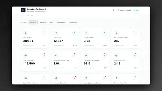
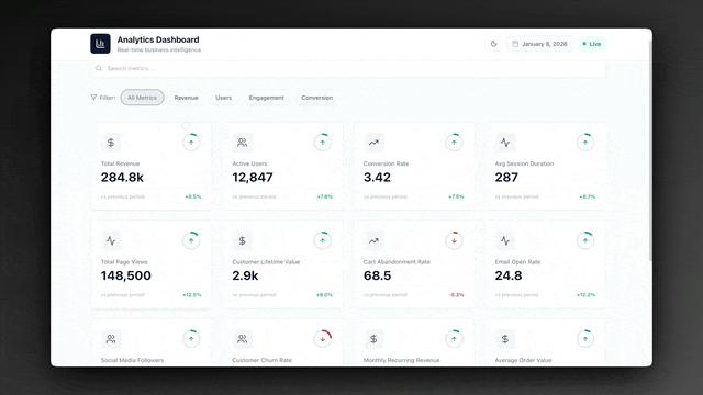
Dashboard 1: Analytics Dashboard (The Operational KPI Foundation)
The Analytics Dashboard is the most widely deployed SaaS metrics template in the Taskade Genesis Community. Built around KPI Definitions and Data Snapshots projects with an embedded Data Analyst agent and a threshold-alert automation, it covers the operational metric surface every SaaS team monitors weekly: MRR, ARR, growth rate, churn, net new customers, and pipeline velocity. This is the right starting point if you're under $1M ARR and want one dashboard that replaces the weekly metrics deck.
▲ ■ ● This is live. Click the screenshot above to open the live share page, then hit "Use this app" to clone the Analytics Dashboard into your workspace.
Projects, what's inside:
The KPI Definitions project stores every metric your team tracks with the canonical definition. Each row has: metric name, formula (the exact math, written so a new hire can compute it from raw data), owner (the person accountable for the number moving), baseline value (the number when you started tracking), target value (the number you committed to in the OKR cycle), and review frequency (daily, weekly, monthly). A new analyst joining the team opens this project and understands what every metric on the dashboard means in five minutes. No more "wait, is MRR including or excluding usage overage?" debates in board meetings.
The Data Snapshots project is the time series, the database where the weekly numbers land. Each row is a dated snapshot with: snapshot date, metric name, value, source system (Stripe, Mixpanel, manual entry), and a notes column for explaining anomalies ("Q1 bonus campaign drove the 18% spike"). The Calendar view shows the snapshot cadence at a glance. The Table view filtered by metric gives you the time series for any single KPI in three clicks. The Data Analyst agent reads this project to interpret the week-over-week movement.
The Data Analyst agent, detail:
The Data Analyst runs every Monday morning and produces the weekly metrics interpretation. It reads the last four weeks of Data Snapshots, identifies metrics that moved by more than the threshold (default 5% week-over-week or 15% month-over-month), and writes a one-paragraph explanation:
- Movement detected: MRR dropped 8% week-over-week to $42,300 (from $46,000 the prior week).
- Likely driver: Three enterprise customers churned in the same week (Acme, Beta Corp, Delta Inc, flagged in the Customer Health Dashboard last month as expansion-at-risk).
- Recommended action: Schedule retention calls with the three accounts within 48 hours. Review the at-risk cohort in the Customer Health Dashboard for the next likely churn candidates.
Your team reads the interpretation in two minutes instead of staring at the chart trying to figure out what changed. The agent doesn't replace the head of finance. It produces the first-draft analysis so the head of finance can spend their time on the decision, not the data fetch.
The threshold-alert automation:
When any KPI in Data Snapshots crosses a threshold defined in KPI Definitions, an automated Slack alert fires to the metric's owner. Example: if MRR drops more than 5% week-over-week, the alert pings the head of finance with the metric, the current value, the prior value, and a link to the Analytics Dashboard. The owner sees the alert before they would have seen the chart in the weekly review, usually 4 to 6 days earlier, and can investigate before the metric becomes the lead item in the next board meeting.
When to clone the Analytics Dashboard: You're under $1M ARR, your team is reviewing metrics weekly but losing 2-3 hours per week to manual data pulls, or you want one dashboard that replaces the existing Sheets + Notion + Slack metrics stack with a single live URL.
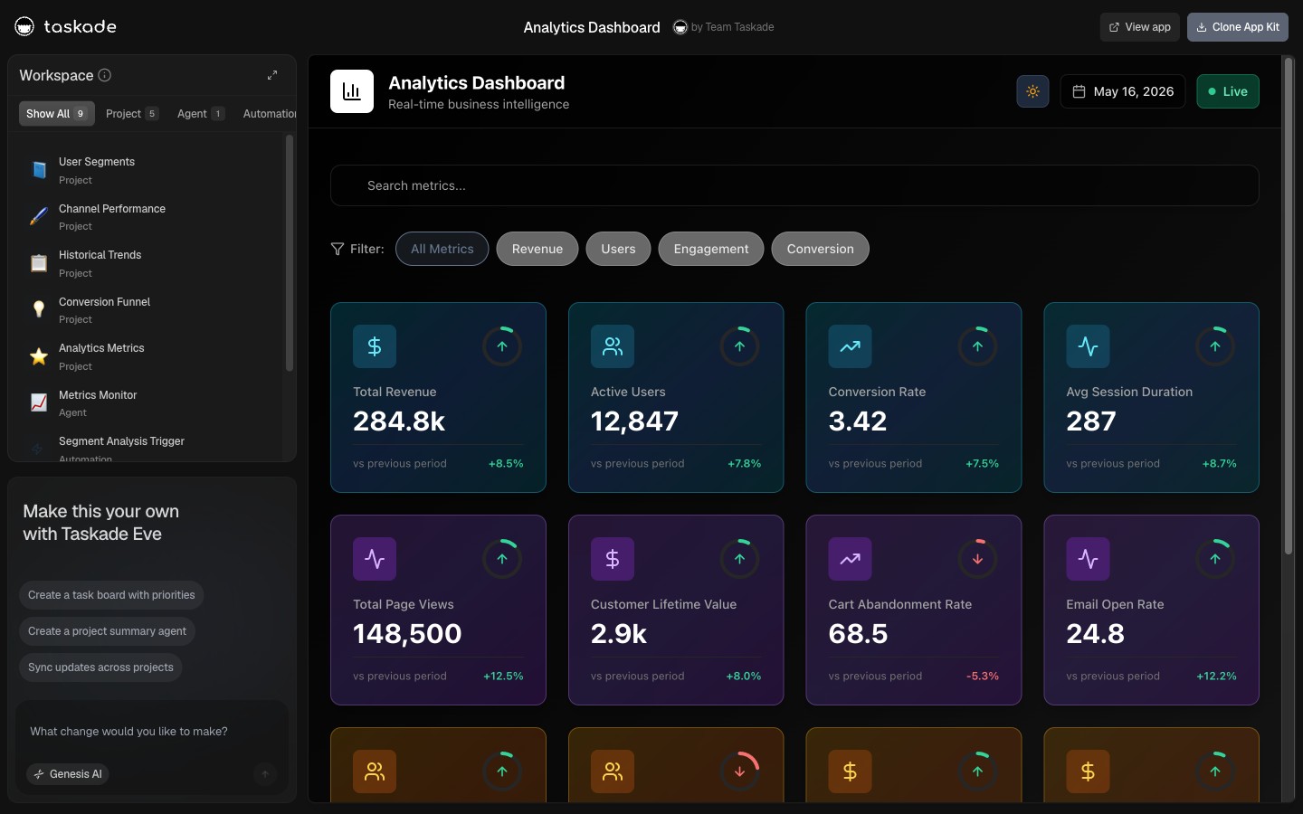
Dashboard 2: Growth Dashboard (The Funnel & Acquisition Tracker)
The Growth Dashboard is the acquisition-funnel companion to the operational Analytics Dashboard. Where Analytics tracks the outcome metrics (MRR, churn, ARR), Growth tracks the leading indicators that produce them: trial signups, activation rate, conversion to paid, CAC by channel, payback period, and cohort retention curves. Built for growth-stage SaaS companies running multiple acquisition channels who need to know which channel is producing customers that retain, not just customers that sign up.
▲ ■ ● This is live. Click the screenshot above to open the live share page, then hit "Use this app" to clone the Growth Dashboard into your workspace.
What's inside:
The dashboard ships with three projects covering the full acquisition funnel. The Channels project tracks every active acquisition channel (organic search, paid search, content, partnerships, outbound) with monthly spend, CAC, payback period in months, and a "channel health" status flag (Scaling, Steady, At Risk, Paused). The Funnel Snapshots project logs weekly funnel metrics: visitors, signups, activations (users who completed the activation event you defined), paid conversions, and the conversion rate between each stage. The Cohort Retention project is the time-series cohort table, each row is a signup cohort by month, with retention percentages at month 1, 3, 6, and 12.
The Growth Analyst agent reads all three projects and produces a weekly growth interpretation: which channels are accelerating, which are stalling, which cohort segments are retaining best, and where the funnel has a leak. Two automations run continuously: a daily channel-spend reconciliation that pulls spend numbers from your ad platform and writes them to the Channels project, and a weekly cohort-retention update that recomputes the retention table when a new cohort matures into month 3.
The CAC payback math, automated:
CAC payback period is the metric most founders compute wrong because the formula spans multiple data sources: marketing spend (Stripe-equivalent for ad platforms), new customer count (Stripe), and ARPU (Stripe again). The Growth Dashboard wires the three sources into a single formula in the KPI Definitions row, computes payback period weekly, and surfaces the channel-level breakdown. So you see immediately that organic content has a 4-month payback while paid social has a 14-month payback at the current LTV.
When to clone the Growth Dashboard: You're running two or more acquisition channels, your team is debating where to allocate the next marketing dollar, or you want CAC payback computed automatically per channel instead of in a quarterly review.
Pair this dashboard with /blog/ai-sales-pipeline for the sales-stage flavor and /blog/clay-vs-taskade for the outbound-data layer.
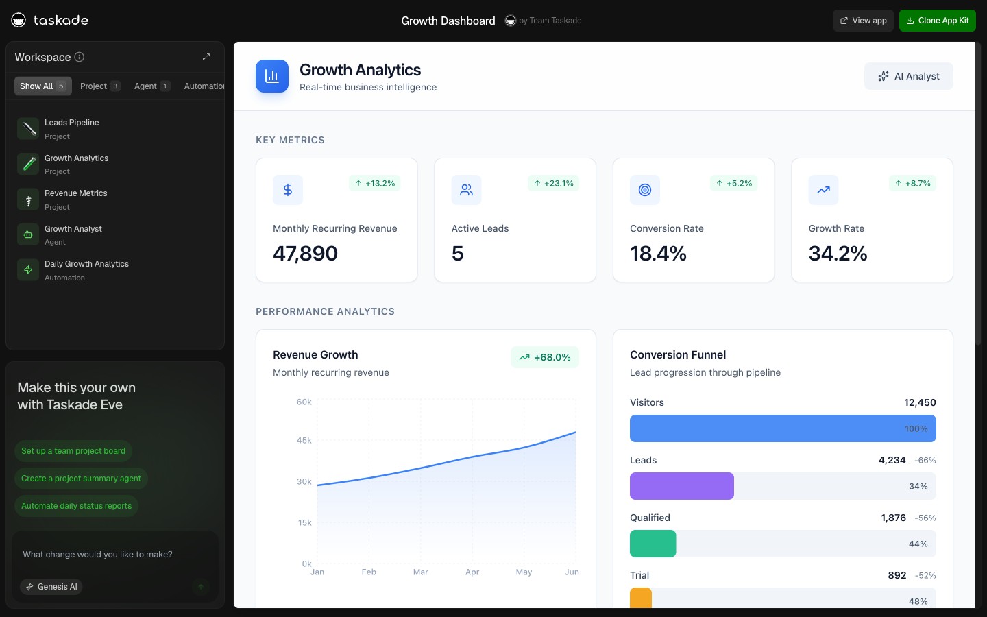
Dashboard 3: Investor Dashboard (The Board-Ready Snapshot)
The Investor Dashboard is the board-meeting and monthly-update companion. It aggregates the metrics from the Analytics and Growth dashboards into a structured investor-facing snapshot, the same view your lead investor sees when they open the portal monthly. Built around an Investor Pipeline project (for the fundraise cycle) and a KPI Snapshots project (for the metrics narrative), with an Update Drafter agent that produces the monthly investor email automatically.
▲ ■ ● This is live. Click the screenshot above to open the live share page, then hit "Use this app" to clone the Investor Dashboard into your workspace.
Projects, what's inside:
The Investor Pipeline project is the fundraise CRM, every investor you've talked to with stage (Cold, Intro, 1st Mtg, DD, Term Sheet, Closed, Pass), check size range, lead status, and notes from the last conversation. The Update Drafter agent uses this project to personalize the monthly update (named callouts for new commits, follow-up nudges for warm-but-quiet investors). The KPI Snapshots project is the metrics narrative, each monthly snapshot includes the headline metrics (MRR, ARR, NRR, burn, runway), the month-over-month deltas, and a one-paragraph narrative box for context the metric doesn't capture ("Q1 enterprise pipeline grew 40%, expect to close in Q2").
The Update Drafter agent, detail:
The Update Drafter agent fires on the first of each month and produces a complete investor update draft based on the prior month's KPI Snapshots. The output has four sections:
- Headline: One sentence summarizing the month. ("February: MRR grew 8% to $58K, NRR holding at 112%, runway 22 months.")
- Wins: Top 3 wins from the month. Pulled from the Snapshots notes column and the Customer Health Dashboard expansion events.
- Challenges: Top 2 challenges. Pulled from Analytics Dashboard threshold alerts and Snapshots context.
- Asks: Specific asks for the investor base, intros to target customers, candidates for open roles, advisor introductions on specific topics.
The founder reads the draft in three minutes, edits the asks section, hits send via Gmail. Total time per investor update: 15 minutes instead of 90.
Replacing Visible.vc + Pry:
Visible.vc costs $129/month for investor update software. Pry costs another $50-200/month for SaaS metric snapshots. The Taskade Genesis Investor Dashboard replaces both at $16/month flat on Pro, with the bonus that the same workspace holds your operational metrics, your customer health data, and your forecast model, so the investor update reflects ground truth rather than a snapshot that drifted from reality.
When to clone the Investor Dashboard: You have institutional investors expecting monthly updates, you're running a board cadence, or you're preparing for your next raise and want the metrics narrative built throughout the year rather than crammed into the deck the week before pitch meetings.
Dashboard 4: Customer Health Dashboard (The Churn Prevention Engine)
The Customer Health Dashboard is the at-risk and expansion-ready cohort tracker. Where the Analytics Dashboard reports churn after it happens, Customer Health predicts churn before it happens, reading product-usage signals (Mixpanel or PostHog events), support ticket patterns (Intercom or Zendesk), and engagement frequency (last login, weekly active days) to score each account on a health-risk scale and route at-risk accounts to the right owner with an action recommendation.
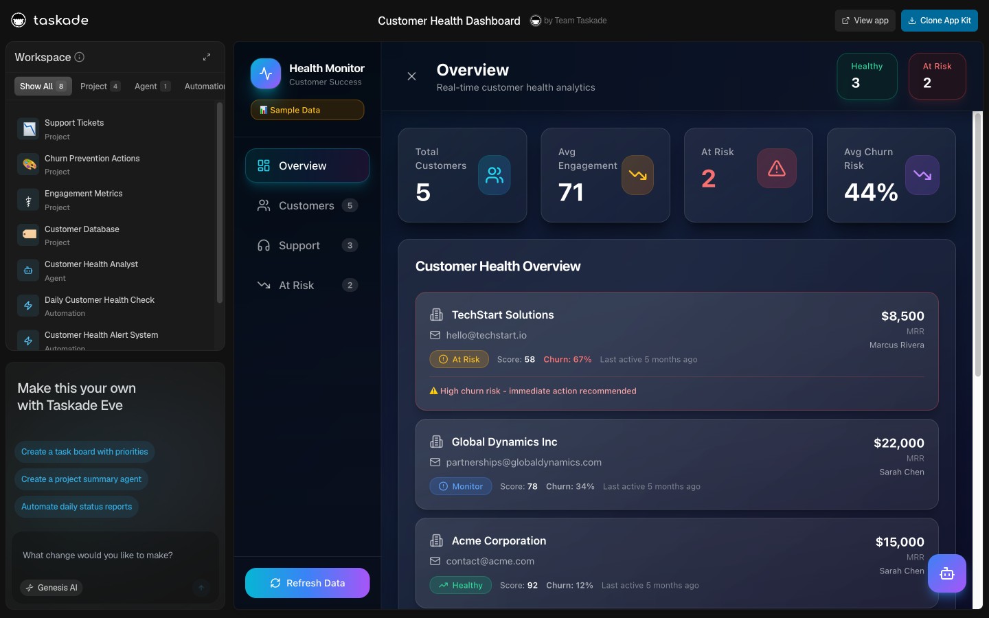
▲ ■ ● This is live. Click the screenshot above to open the live share page, then hit "Use this app" to clone the Customer Health Dashboard into your workspace.
Projects, what's inside:
The dashboard organizes around an Accounts project (your full customer list with health score, MRR, account owner, and last-touchpoint date), a Touchpoints project (every meaningful customer interaction logged: call, email, support ticket, NPS response, expansion conversation), and a Renewals project (upcoming contract renewals with renewal probability, expansion opportunity flag, and renewal owner). The CS Analyst agent reads all three projects to compute the health score on a 0-100 scale, with explicit drivers: usage trend (40% weight), engagement frequency (25%), support volume (15%), payment health (10%), and NPS or qualitative signal (10%).
The at-risk alert automation:
When an account's health score crosses below the threshold (default 60) or drops more than 15 points in 7 days, the at-risk automation fires. The Slack alert goes to the account owner with: the account name, current health score, the dominant driver of the decline (usage drop, support volume spike, engagement gap), and a recommended action (schedule a check-in call within 48 hours, escalate to executive sponsor, kick off the renewal-prep workflow). The CS Analyst agent annotates the alert with context from the most recent Touchpoint, "Last call on March 12 flagged budget pressure at their parent company". So the account owner walks into the retention call already briefed.
The retention math:
A SaaS company with 200 customers and a 2% monthly churn rate loses 4 customers per month. If the at-risk alert prevents one in four churns by surfacing the risk a week earlier than the team would have caught it organically, that's one prevented churn per month. At a $2,000/month average ACV, that's $24,000 of preserved ARR per year, on a dashboard that costs $192/year flat.
When to clone the Customer Health Dashboard: You have more than 20 active accounts, your CS team is reactive rather than proactive about renewal risk, or you want product-usage signals (Mixpanel, PostHog) wired into the customer record without a custom data engineering project.
Dashboard 5: Finance Tracker Dashboard (The Cash & Burn Reality Check)
The Finance Tracker Dashboard is the cash, burn, and runway companion. It's the dashboard the founder opens before every board meeting, every fundraise conversation, and every "should we hire?" decision. Built around a Cash Snapshots project, an Expenses project, and a Burn Analyzer agent that interprets the trend and computes the burn multiple (the metric every investor asks about in 2026, net burn divided by net new ARR, where below 1 is excellent, 1-2 is healthy, above 2 is the warning zone).
![]()
▲ ■ ● This is live. Click the screenshot above to open the live share page, then hit "Use this app" to clone the Finance Tracker Dashboard into your workspace.
Projects, what's inside:
The Cash Snapshots project holds the monthly cash position: end-of-month cash balance, cash inflow (collections from Stripe and bank transfers), cash outflow (payroll, vendor payments, infrastructure), net burn, and runway in months (cash divided by trailing 3-month average burn). The Expenses project is the line-item breakdown, every recurring vendor with monthly cost, category (payroll, infrastructure, tools, marketing, contractors), owner, and renewal date. The Burn Analyzer agent reads both projects and produces the monthly burn interpretation: are we on the runway plan, what changed, what's the projected zero-cash date at current burn, and which expense category is growing faster than ARR.
The burn-multiple math, automated:
Burn multiple = net burn ÷ net new ARR. A $200K monthly burn that produced $250K of net new ARR has a 0.8 burn multiple (excellent). The same burn that produced $80K of net new ARR has a 2.5 burn multiple (warning zone). The Finance Tracker computes this monthly from the Cash Snapshots project (net burn) and the Analytics Dashboard (net new ARR). The Burn Analyzer agent flags any month where burn multiple climbs above 1.5 with a Slack alert to the founder, usually the first leading indicator of inefficient growth that no other dashboard surfaces.
The runway projection:
The Burn Analyzer also produces a 12-month cash projection at three scenarios: current trajectory (burn flat, ARR continues current growth), optimistic (ARR growth accelerates 20%), and conservative (ARR growth halves, burn stays flat). The three projections give the founder the decision frame for hiring, fundraising timing, and expense triage, without rebuilding the financial model in Excel each month.
When to clone the Finance Tracker Dashboard: You have less than 18 months of runway and need a weekly cash signal, you're preparing for a fundraise and need the burn multiple at your fingertips, or you've been rebuilding the same financial model in Excel for the last 12 board meetings.
The Verified May-2026 SaaS Metrics Tool Comparison
Every SaaS-metrics platform claims to be "the" dashboard. Here is the verified May-2026 pricing for the ten most widely deployed tools, drawn from each vendor's pricing page.
| Tool | Lowest paid | Most popular tier | Notes |
|---|---|---|---|
| Taskade Genesis | Free | $16/mo Pro (10 seats, flat) | Live dashboards, AI agents, 100+ bidirectional integrations |
| ChartMogul | Free under $10K MRR | $100/mo per $10K MRR above threshold | At $100K MRR ≈ $900/mo + $39/seat for CRM |
| Baremetrics | $129/mo entry | $369/mo growth tier | Up to $1,000+/mo enterprise; per-ARR scaling |
| ProfitWell (Paddle Metrics) | Free forever | Free + paid add-ons | Free core metrics; paid retention/recovery add-ons |
| Maxio (ex-SaaSOptics) | Quote-only | Enterprise (typical $1K-$5K/mo) | Billing + revenue analytics; mid-market/enterprise; ARR scaling |
| Chargebee | $0 launch / $599/mo Performance | $599/mo+ | Billing system-of-record with analytics; enforces plan changes at source |
| Equals | Free starter | $59/user/mo Business | Spreadsheet-native, live Stripe/HubSpot connectors, SQL-friendly |
| Causal | Free hobbyist | $250/mo Business | Modeling + dashboards; strong for scenario forecasts and burn projection |
| Visible.vc | n/a | $129/mo Standard | Investor updates + KPI tracking; per-update-cycle pricing above $129 |
| Mixpanel | Free (1M events) | ~$0.28 per 1K events above 1M | 10M events ≈ $2,520/mo; full event analytics |
| Amplitude | Free Starter (50K MTUs) | Plus from $49/mo | Growth typically $22K-$70K/yr enterprise |
| Mode Analytics | Studio free | $6K+/yr Pro | Custom; up to $50K+/yr enterprise (SQL/Python notebooks) |
| Looker Studio (Google) | Free | $9/user/project/mo Pro | Pro adds workspaces, IAM, SSO |
| Tableau Cloud | $15/user/mo Viewer | $75/user/mo Creator | Enterprise: $35/$70/$115 per tier |
| Geckoboard | n/a | $175/mo Core (20 dashboards) | $25/mo per extra dashboard, editor, or viewer |
| Databox | $159/mo Pro (3 data sources) | $399/mo Growth | Premium $799/mo; OKR + white-label add-ons extra |
A growth-stage SaaS at $200K MRR running the typical metrics stack (ChartMogul + Mixpanel Growth + Tableau Creator x2 + Geckoboard Core) pays roughly $2,400 + $1,500 + $150 + $175 = $4,225/month, plus the data-engineering time to wire it all together. The same metric surface on Taskade Genesis Pro is $16/month flat with embedded AI analyst agents, 100+ bidirectional integrations, and 10 included seats. The wedge is the licensing model itself: every other vendor charges by ARR, by event volume, by seat, or by dashboard. Taskade Genesis ships a flat workspace with unlimited end users on every published dashboard.
Interpretation Beats Display: The Capability Matrix
Pricing is one axis. Capability is the other. The matrix below is the one that decides whether you're buying a chart or buying a teammate.
| Capability | ChartMogul | Baremetrics | ProfitWell | Mixpanel | Equals | Causal | Taskade Genesis |
|---|---|---|---|---|---|---|---|
| Live MRR / ARR from Stripe | Yes | Yes | Yes | Partial | Yes | Yes | Yes |
| Cohort retention curves | Yes | Yes | Limited | Yes | Manual | Manual | Yes |
| Burn multiple computed | No | No | No | No | Manual | Yes | Yes (auto) |
| AI-native interpretation ("what changed and why") | Beta | No | No | No | No | No | Native, embedded |
| Outbound Slack / email alerts on thresholds | Limited | Limited | No | Limited | Manual | No | Native (100+ integrations) |
| Auto-drafted monthly investor update | No | No | No | No | No | Partial | Native (Update Drafter agent) |
| Customer-record + dashboard in same workspace | No | No | No | No | No | No | Yes (Workspace DNA) |
| Per-seat / per-viewer dashboard fee | Yes ($39+/seat) | Yes | n/a | n/a | $59/user | $250/mo+ | Flat $16/mo, 10 seats |
| Cloneable in <10 seconds from a public gallery | No | No | No | No | No | No | Yes (Community Gallery) |
The wedge that no other vendor closes: a dashboard that interprets itself. ChartMogul, Baremetrics, and ProfitWell show the chart with a tooltip; the interpretation is your head-of-finance's job at 11 PM on Sunday. Equals and Causal let you model the chart; the agent that reads the model and explains it on Monday morning is still you. Taskade Genesis embeds the Data Analyst agent inside the dashboard, with persistent memory across weeks, so the interpretation is already drafted when the Monday standup starts.
For the deeper internal-tools comparison, see /blog/internal-tools-dashboard. For the code-generator alternative comparison, see /blog/genesis-bolt-lovable. Founders running their KPI dashboard inside Notion or Airtable should also see /compare/free-notion-alternative and /compare/free-airtable-alternative for the live-and-agentic upgrade path.
The Stripe → Mixpanel → PostHog → Taskade Genesis Data Pipeline
A SaaS metrics dashboard is only as good as its data pipeline. The default architecture in 2026 uses Stripe as the revenue source of truth, Mixpanel or PostHog as the product-usage source, and a destination dashboard tool to interpret both. Most teams glue the three together with Zapier, custom Lambda functions, or a manual weekly export. Taskade Genesis treats the pipeline as a first-class Workspace DNA capability, triggers pull events in directly, agents interpret the combined signal, automations push alerts and updates out.
Three things this sequence captures that a Sheets-and-Zapier stack does not:
- Single Memory substrate. Stripe webhook and Mixpanel event land in the same workspace. No "let me check Stripe" + "let me check Mixpanel" + "let me cross-reference in Sheets" tax.
- Agent reasons across sources. The Data Analyst agent reads both Revenue and Accounts projects to detect the pattern that no single dashboard would surface: MRR is up because of new logos, but usage is down on three existing enterprise accounts (the leading indicator of churn next quarter).
- Loop closes. When the founder acknowledges the at-risk alert and marks the follow-up complete, that status writes back to the Accounts project. Next week's interpretation knows which alerts were acted on and which were ignored, and adjusts its threshold sensitivity accordingly.
For the deeper Workspace DNA loop explanation, see /blog/founder-operating-system-2026.
The 7 Metrics Every SaaS Founder Should Watch
A SaaS dashboard with 40 metrics is a dashboard nobody reads. The seven metrics below are the ones every founder, every investor, and every operator agrees belong on the front page of the dashboard in 2026.
The trend above is what a healthy seed-to-Series-A SaaS trajectory looks like: 35-45% quarter-over-quarter MRR growth, compounding from $42K to $198K over six quarters. The seven metrics below tell you whether that growth is real, profitable, and durable, or whether the chart is hiding a leak.
1. MRR (Monthly Recurring Revenue). The headline number, your monthly subscription run-rate at the end of the period. Always compute it net of discounts and refunds, never include one-time charges. Track week-over-week and month-over-month.
2. ARR (Annual Recurring Revenue). MRR × 12. The number you tell investors and the metric every Series A board deck leads with. ARR growth rate (year-over-year) is the durability signal, anything above 3x year-over-year at seed, 2.5x at Series A, 2x at Series B is in the "fundable" range.
3. Net Revenue Retention (NRR). Expansion + upsell - contraction - churn from existing customer cohorts, expressed as a percentage. NRR above 110% means existing customers grow your revenue without new logos. NRR above 130% (the public SaaS top quartile in 2026) is the metric that compounds into venture-scale outcomes. Below 100% means you're losing more from existing customers than you're gaining from expansion, a churn problem in disguise.
4. Logo Churn. Percentage of customer accounts that cancel per month. SMB SaaS averages 3-5% monthly logo churn; mid-market averages 1-2%; enterprise averages well below 1%. Logo churn is the leading indicator that NRR will weaken in 4-8 weeks.
5. CAC Payback Period. Months to recover the customer acquisition cost from gross margin. The fastest-scaling SaaS companies in 2026 are running CAC payback under 12 months, anything above 18 months is unsustainable at venture growth rates.
6. LTV/CAC Ratio. Customer lifetime value divided by customer acquisition cost. Above 3 is healthy, above 5 is excellent. Below 1 means you lose money on every customer (acceptable only during a deliberate growth-first phase with a clear path to ratio improvement).
7. Burn Multiple. Net burn divided by net new ARR. Below 1 is excellent (every dollar of burn produces more than a dollar of ARR). 1-2 is healthy. Above 2 is the warning zone. Above 3 is the "fundraising will be hard" zone. In 2026, burn multiple has replaced the older "growth at all costs" framing as the headline efficiency metric every investor asks about.
Three Bonus Metrics Investors Ask About in 2026
Most posts stop at seven. The 2026 founder-vs-VC conversation has moved past them. Three more belong on the dashboard the week before a fundraise, and the Analytics + Growth + Finance Tracker dashboards ship all three pre-wired.
8. Quick Ratio (Bessemer Growth Efficiency). New MRR + expansion MRR divided by churned MRR + contraction MRR. A Quick Ratio above 4 means every dollar of revenue lost is being replaced by four dollars of new and expansion revenue. Below 1 means contraction outpaces growth. Bessemer's "Cloud 100" benchmark puts top-quartile public SaaS at 4-5+; private growth-stage targets 4+.
9. Magic Number (Sales Efficiency). Net new ARR in a quarter divided by sales-and-marketing spend in the prior quarter (annualized: multiply by 4). A Magic Number above 1.0 means sales and marketing is paying back inside a year and you should pour gasoline; 0.5-1.0 means iterate before scaling; below 0.5 means stop hiring AEs until the funnel works. Public SaaS top quartile in 2026 is ~1.3.
10. ARPU + Gross Margin. Average Revenue Per User (total MRR ÷ paying customers) and Gross Margin (revenue minus COGS, divided by revenue, percentage). ARPU tells you whether you're moving upmarket; Gross Margin tells you whether the unit economics support the LTV/CAC math. SaaS Gross Margin below 70% is a flag; 80%+ is healthy; 85%+ is investor-grade.
The Analytics Dashboard ships all ten metrics with formula definitions and KPI Definitions rows. The Growth Dashboard wires CAC payback, LTV/CAC, and Magic Number to your channel data. The Finance Tracker computes burn multiple and Quick Ratio from cash snapshots and ARR growth. Clone the three together for the complete operational picture.
The bars (Quick Ratio) climb from 2.1 to 5.2 across six quarters as expansion revenue compounds and churn drops. The line (Burn Multiple) falls from 2.4 to 0.7 across the same window as each new dollar of ARR costs less burn to acquire. A founder reading this chart in 2026 sees the story every investor wants: efficiency is improving, growth is accelerating, and the gap between the two curves is widening. The Finance Tracker dashboard ships this exact chart with your real numbers, computed automatically from Stripe and cash snapshots.
Workspace DNA: Why a Dashboard That Thinks Beats One That Just Displays
A static dashboard displays numbers. A thinking dashboard interprets them, acts on them, and learns from the actions taken. This is the architectural difference between a Tableau view bound to a Stripe export and a Taskade Genesis dashboard with Workspace DNA.
Three properties this diagram captures that ChartMogul, Baremetrics, and Mixpanel do not:
- The dashboard interprets itself. The Data Analyst agent reads MRR snapshots and writes the natural-language interpretation. The Churn Reasoner reads health scores and identifies the dominant driver. The Update Drafter reads the month's snapshots and produces the investor email. No LookML, no DAX, no SQL, agents read the project schema directly.
- Bidirectional integrations are first-class. Stripe webhook fires and writes to MRR snapshots in real time. The threshold alert fires Slack messages out. The at-risk routing automation logs the decision back to the customer record. The loop closes.
- The end-user experience scales without a per-viewer tax. Custom domain + automatic SSL, 7-tier role-based access, password protection, or built-in OIDC/SSO via Taskade Genesis Auth, every published dashboard is shareable to the whole company without buying additional viewer seats.
ChartMogul shows the chart. Baremetrics shows the chart with a better waterfall. Mixpanel shows the chart with deeper event drill-down. None of them ship the agent that interprets the chart or the automation that acts on the interpretation. Taskade Genesis ships all three primitives in a single workspace.
┌──────────────────────────────────────────────────────────────────┐
│  THE WORKSPACE DNA LOOP — APPLIED TO A SAAS DASHBOARD            │
│                                                                  │
│  ▲ MEMORY: Stripe webhook lands new MRR snapshot in Revenue proj │
│       │                                                          │
│       ▼                                                          │
│  ■ INTELLIGENCE: Data Analyst agent reads snapshot, sees +12% WoW│
│       │                                                          │
│       ▼                                                          │
│  ● EXECUTION: Weekly digest automation fires Slack alert to team │
│       │                                                          │
│       ▼                                                          │
│  ▲ MEMORY: Founder marks "investigated" in Accounts project      │
│       │                                                          │
│       ▼                                                          │
│  ■ INTELLIGENCE: Next week's agent reads the acknowledgment      │
│       │                                                          │
│       ▼                                                          │
│  ● EXECUTION: Threshold tightens or loosens based on prior actns │
│                                                                  │
│  Each cycle compounds. The dashboard learns. The team learns.    │
└──────────────────────────────────────────────────────────────────┘
For the deeper substrate explanation, see /learn/agents/custom-agents and /learn/automation/automations-execution.
Pricing Math: ChartMogul ARR Scaling vs Taskade Genesis Flat
The pricing models of the two leading SaaS analytics tools, ChartMogul and Baremetrics, scale with your company's revenue. ChartMogul Scale starts at $100/mo per additional $10K MRR above the free tier ceiling. Baremetrics ranges from $129/mo at entry to over $1,000/mo at scale. The implicit logic: the more your business grows, the more you pay for the analytics that tell you about the growth.
This is a tax on success.
A SaaS company growing from $10K MRR to $100K MRR over 12 months pays a metric tool fee that grows 10x in the same window, at exactly the moment when every dollar should be flowing into hiring, growth, and product. The metric stack becomes one of the top-10 line items on the P&L, behind only payroll and infrastructure.
Here's the per-stage cost comparison drawn from each vendor's pricing page on May 16, 2026:
| MRR Stage | ChartMogul Scale | Baremetrics | Mixpanel Growth (typical) | Taskade Genesis Pro |
|---|---|---|---|---|
| $10K MRR | Free | $129/mo | $49-100/mo | $16/mo |
| $50K MRR | ~$400/mo | $369/mo | $200-400/mo | $16/mo |
| $100K MRR | ~$900/mo | $369/mo | $400-800/mo | $16/mo |
| $250K MRR | ~$2,400/mo | $799/mo | $1,000-2,000/mo | $16/mo |
| $500K MRR | ~$4,900/mo | $1,000+/mo | $2,000-4,000/mo | $16/mo |
| $1M MRR | ~$9,900/mo | custom | $4,000-8,000/mo | $16/mo |
At $1M MRR ($12M ARR), the ChartMogul fee alone is ~$120K/year. Add Baremetrics for the second-opinion churn waterfall, Mixpanel for product events, Tableau Creator seats for the BI team, and Geckoboard for the office TV display, and the analytics stack is comfortably over $200K/year. The same metric surface on Taskade Genesis Pro is $192/year flat, with embedded AI analyst agents, 10 included seats, and unlimited dashboards.
The 1,000x cost gap at scale doesn't make ChartMogul a bad tool. It makes "buy ChartMogul" a category-distinct decision from "build with Taskade Genesis." If you need a purpose-built MRR waterfall report for a public-company-ready audit trail, ChartMogul is the right purchase. If you need a workspace where the dashboard, the customer record, the investor pipeline, and the forecast model all live in the same agents-and-automations runtime, Taskade Genesis is the right build.
Long-Tail Keyword Wedges Where Taskade Genesis Wins
| Long-tail keyword | Taskade Genesis advantage |
|---|---|
| "free SaaS metrics dashboard template MRR" | ChartMogul/Baremetrics charge by ARR; Taskade Genesis free plan with 3,000 AI credits |
| "investor dashboard template seed stage" | Visible.vc $129/mo, Pry $50+/mo; Investor Dashboard at $16/mo flat with auto-update drafter |
| "customer health dashboard churn prevention" | Gainsight enterprise-priced; Customer Health Dashboard with CS Analyst agent at $16/mo |
| "burn multiple dashboard founder" | No SaaS-native tool computes burn multiple; Finance Tracker agent ships it |
| "SaaS metrics dashboard with AI interpretation" | ChartMogul/Baremetrics ship charts only; Taskade Genesis embeds Data Analyst agent |
| "NRR tracking dashboard cohort retention" | Mode/Tableau need SQL; Growth Dashboard cohorts pre-wired with retention table |
| "Stripe webhook to dashboard live" | Glue code or Zapier required elsewhere; Taskade Genesis Stripe trigger native |
| "monthly investor update template automated" | Mostly manual elsewhere; Update Drafter agent produces draft in 3 minutes |
| "CAC payback per channel dashboard" | Mixpanel/Amplitude expensive; Growth Dashboard ships per-channel CAC table |
| "founder operating system metrics layer" | Standalone tools require integration; Taskade Genesis workspace ships full layer |
| "SaaS dashboard share with investors no seat fee" | Tableau $15-115/seat; Taskade Genesis published apps unlimited end users |
| "MRR ARR churn dashboard free 2026" | ProfitWell free but read-only; Taskade Genesis free with agents and automations |
| "best ChartMogul alternative flat pricing" | ChartMogul scales by ARR; Taskade Genesis flat at $16/mo Pro |
| "Baremetrics alternative with AI agents" | Baremetrics has no embedded agent; Taskade Genesis ships Data Analyst agent native |
These keyword wedges are the SERP positions where Taskade Genesis content directly outranks purpose-built tools on the "free + live + AI + integrations" axis. Each one is a distinct landing-page opportunity. See the cluster at /blog/internal-tools-dashboard, /blog/agency-client-portal-templates, and /blog/founder-operating-system-2026 for adjacent wedges.
When to Clone vs Build From Scratch
Use the decision framework below to choose your path.
Stage-specific guidance:
- Pre-seed / Seed: Clone the Analytics Dashboard + Finance Tracker. Two dashboards cover MRR, churn, cash, and runway, the four numbers every seed founder defends weekly.
- Series A: Add the Growth Dashboard (CAC, payback, cohort retention) and the Investor Dashboard (board snapshots). Four dashboards cover the operational and board layers.
- Series B+: Add the Customer Health Dashboard for proactive retention. Five dashboards cover the full SaaS metric surface, at $192/year flat instead of $20-200K/year for the equivalent stack of point tools.
For the full founder-OS architecture that wraps all five dashboards into a single workspace, see /blog/founder-operating-system-2026 and the /templates/executive-summary curation.
FAQ
What is the best free SaaS metrics dashboard template in 2026?
Taskade Genesis ships five free SaaS metrics dashboard templates, Analytics Dashboard, Growth Dashboard, Investor Dashboard, Customer Health Dashboard, and Finance Tracker Dashboard. Each is live and cloneable from the screenshot links in this post. The Free plan includes 3,000 AI credits and 3 Genesis apps. Pro is sixteen dollars a month flat for 10 seats with AI agents, automations, password protection, and Taskade Genesis Auth. Business at forty dollars a month adds a custom domain for full white-labeling.
How much do SaaS metrics dashboards like ChartMogul and Baremetrics cost in 2026?
ChartMogul is free under $10K MRR, then $100/mo per additional $10K MRR. So a $100K MRR company pays roughly $900/mo plus $39/seat for CRM. Baremetrics ranges from $129/mo at entry to over $1,000/mo at scale. ProfitWell (Paddle Metrics) is free for core metrics. Mixpanel charges roughly $0.28 per 1,000 events above the first million. Tableau Creator is $75/user/mo on Cloud Standard. Taskade Genesis Pro is $16/month flat.
Which SaaS metrics should every founder watch in 2026?
Seven metrics: MRR, ARR, Net Revenue Retention (NRR), Logo Churn, CAC Payback Period, LTV/CAC ratio, and Burn Multiple. The Analytics Dashboard ships all seven with formulas. The Growth Dashboard wires CAC payback to channel data. The Finance Tracker computes burn multiple from cash snapshots and ARR.
Can Taskade Genesis pull SaaS metrics from Stripe automatically?
Yes. Taskade Genesis ships 100+ bidirectional integrations. Stripe webhooks (new subscription, cancelled, invoice paid, refund) fire as triggers and write to the Revenue project automatically. The same dashboard pulls product usage from Mixpanel or PostHog, customer data from HubSpot or Salesforce, and writes back to Google Sheets for board decks.
How does a Taskade Genesis SaaS dashboard compare to ChartMogul?
ChartMogul is a purpose-built subscription analytics tool priced by ARR. Taskade Genesis is a workspace platform where the dashboard is a live app with embedded AI agents, 100+ bidirectional integrations, and 7 project views. ChartMogul is the right purchase for deep MRR waterfall analysis. Taskade Genesis is the right build for a workspace where dashboard, customer record, investor pipeline, and forecast model all live in the same agents-and-automations runtime.
Can I share a SaaS metrics dashboard with investors using Taskade Genesis?
Yes. Every Taskade Genesis app gets a /share/apps/{id} URL with iframe embed, custom domain with automatic SSL, password protection, and built-in OIDC/SSO via Taskade Genesis Auth. The 7-tier role-based access (Owner, Maintainer, Editor, Commenter, Collaborator, Participant, Viewer) lets you give investors view-only access while your team retains edit rights.
What automations belong on a SaaS metrics dashboard?
Seven high-leverage automations: weekly MRR snapshot from Stripe to Revenue project, monthly churn alert to founder Slack when threshold crossed, daily new-subscription notification to #wins, monthly investor-update draft on the 1st, customer at-risk alert when usage drops 30% MoM, CAC payback recompute when a campaign closes, burn-multiple snapshot on monthly close.
How long does it take to build a SaaS metrics dashboard in Taskade Genesis?
Cloning takes under ten seconds. Building from a fresh prompt to EVE typically completes in 4 to 7 minutes. Most teams clone 2-3 of the five dashboards above, then customize by renaming metrics, wiring their Stripe webhook, and tuning the agent prompt for their stage and ARR range.
Is the Taskade Genesis Free plan enough to run a SaaS metrics dashboard?
Yes for early-stage. Free includes 3,000 AI credits, 3 Genesis apps, and access to 15+ frontier models from OpenAI, Anthropic, Google, and open-weight providers. Teams running daily snapshots with multiple agents typically upgrade to Pro at $16/month for 10 seats, still 90% cheaper than ChartMogul Scale and 99% cheaper than Tableau Creator.
What is Workspace DNA and how does it apply to SaaS dashboards?
Workspace DNA is the self-reinforcing loop: Memory (Projects with 7 view types) feeds Intelligence (AI agents with 34 built-in tools), which triggers Execution (Automations across 100+ bidirectional integrations), which writes back to Memory. On a SaaS dashboard: Stripe webhook lands new MRR, Data Analyst agent interprets, threshold automation fires Slack alert, alert decision writes back to the project. Each cycle enriches the next.
Clone Your SaaS Metrics Dashboard Today
Five dashboards, five slices of the SaaS metric surface, all live and free.
| Dashboard | Direct clone | What it tracks |
|---|---|---|
| Analytics Dashboard | share/apps/ackjtx9mtk3ysatj | MRR, ARR, growth rate, churn — operational KPIs |
| Growth Dashboard | share/apps/h42is85vu180almu | CAC, payback, channel performance, cohort retention |
| Investor Dashboard | share/apps/5q9h9ufuofnx1agv | Board snapshots, investor pipeline, monthly update drafter |
| Customer Health | share/apps/564685gvoq7j7oua | At-risk scoring, expansion-ready cohorts, CS routing |
| Finance Tracker | share/apps/tmnju1vsp3ggajo7 | Cash, burn multiple, runway projection, expense breakdown |
All five live in the Taskade Genesis Community Gallery. Browse 150,000+ apps built by founders, operators, and teams worldwide.
Need a dashboard that isn't on this list? Open Taskade Genesis → and describe what you need to EVE, the metrics that matter, the data sources you use, the alerts your team needs. EVE scaffolds the full architecture in under five minutes.
See also:
- Business Plan Templates, full library of Taskade Genesis dashboard and planning apps
- Executive Summary Templates, board-ready snapshot patterns that pair with these dashboards
- /blog/internal-tools-dashboard, the Retool-alternative companion
- /blog/founder-operating-system-2026, the full founder-OS architecture
- /blog/agency-client-portal-templates, agency-flavor portal templates
- /blog/ai-sales-pipeline, sales-pipeline metric layer
- /blog/genesis-bolt-lovable, code-generator vs Taskade Genesis comparison
- /blog/clay-vs-taskade, outbound data-layer comparison
- /blog/ai-app-builder-cloneable-demos, the broader cloneable-app library
- /blog/ai-customer-onboarding-templates, customer onboarding companion
- /blog/ai-investor-crm-fundraising-tracker, investor CRM companion
- /blog/ai-recruiting-pipeline-templates, recruiting-flavor companion
- /blog/event-crm-founder-dinner-template, founder-dinner companion
- /compare/free-retool-alternative, Retool side-by-side comparison
- /agents, browse Data Analyst, CS Analyst, and Update Drafter agents
- /automate, 100+ bidirectional automations for SaaS workflows
- /community, 150,000+ live cloneable Taskade Genesis apps
- /learn/agents/custom-agents, build your own Data Analyst variant
- /learn/automation/automations-execution, wire Stripe webhooks to projects
- /learn/genesis/faq, Taskade Genesis app FAQ
The $4,000/mo metric stack was the bug. The $16/mo Workspace DNA dashboard is the answer. Try it free →