


Gantt charts are the standard tool for visual project planning. They show tasks, timelines, and dependencies at a glance, making complex projects manageable. In 2026, AI generates them automatically from project descriptions, estimates task durations, and keeps timelines updated as work progresses.
TL;DR: Gantt charts visualize project schedules as horizontal bars on a timeline. Taskade's AI generates complete Gantt charts from natural language descriptions, with 7 project views, AI agents, and 100+ integrations. Unlike Microsoft Project ($10/user/month) or Smartsheet ($9/user/month), Taskade starts free. Try Taskade free →
This guide covers the history of Gantt charts, how they work, their benefits and limitations, how to create them in Taskade, and how Taskade compares to Microsoft Project and Smartsheet for project management in 2026.
Learning the ropes? Read our guide on the basics of project management first.
What Is a Gantt Chart?
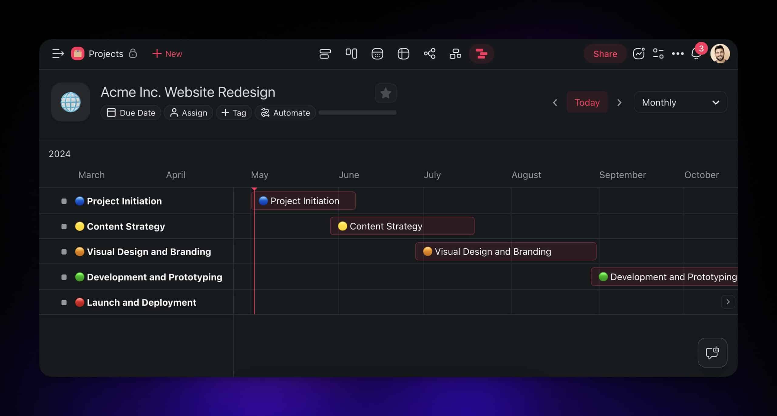
A Gantt chart is a horizontal bar chart that represents a project schedule, showing tasks as bars positioned along a timeline. Each bar's length indicates the task's duration, and its position shows the start and end dates. Dependency lines between bars show which tasks must complete before others can begin.
The origins trace back to 19th century Poland.
In the early 1890s, Polish engineer Karol Adamiecki developed a tool called the "harmonogram," designed to organize tasks and timelines visually within a project. The harmonogram showed task sequences, durations, and interdependencies.
The Harmonogram designed by K. Adamiecki(1)
While Adamiecki's idea was groundbreaking, it did not get widespread attention beyond Poland and Russia. That happened much later with the work of Henry Gantt in the United States.
Around 1910, Gantt devised his own version that presented tasks against time more clearly. Gantt's variation was used extensively on major infrastructure projects including the Hoover Dam and the Interstate Highway system.
Source: "Organizing for Work" by H. L. Gantt(2)
In their modern iteration, Gantt charts are integrated into project management software with real-time updates, drag-and-drop workflows, AI-powered scheduling, and multi-view data visualization.
How Do Gantt Charts Work?
A typical Gantt chart has four core components:
Task List (Left Panel)
On the left side, you find a hierarchical list of all project tasks and subtasks, organized by phase or category.
Timeline Bars (Right Panel)
Tasks appear as horizontal bars across a grid. Each bar indicates the duration of a task -- its position and length are visual cues for when a task begins and how long it lasts.
Timeline Header
At the top, a timeline (daily, weekly, monthly, or yearly) helps position tasks in time and track progress at the appropriate granularity.
Dependency Lines
Lines connecting horizontal bars show task relationships -- which tasks must finish before others can start. These dependency lines are critical for identifying the critical path (the longest sequence of dependent tasks that determines the minimum project duration).
The workflow is simple: list individual tasks on the left, determine start and finish dates, plot them as bars on the timeline, add dependencies between related tasks, and adjust when things shift.
Benefits of Using Gantt Charts
Enhanced Planning and Scheduling
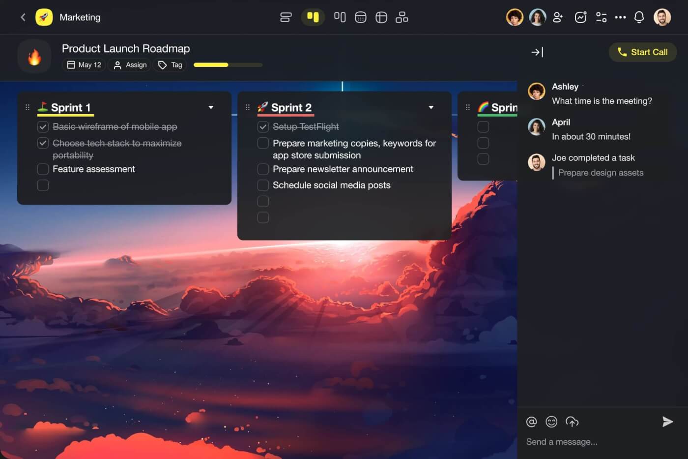
Gantt charts provide a bird's-eye view of your project's journey, breaking it down into clear phases with visible start and end dates. You see when each stage happens and how it connects to the overall timeline.
For teams that need to coordinate multiple workstreams, this visibility is essential. Managers can identify scheduling conflicts before they happen and adjust resource allocation proactively.
Real-Time Progress Tracking
A Gantt chart is a visual snapshot of project status. A quick glance tells you whether you are ahead of schedule, on track, or falling behind. The Today Marker (a vertical line on the chart) provides a constant reference point for evaluating progress against the plan.
Research from the Project Management Institute (PMI) found that organizations using visual project management tools like Gantt charts complete 28% more projects on time compared to those using text-based tracking alone.
Easier Resource Management
Resources are your project's fuel, and Gantt charts help you allocate them wisely. You can see who is doing what and when, ensuring no team member is overloaded while others sit idle.
By visualizing workload distribution, you identify resource constraints and bottlenecks before they cause delays. This is especially valuable for cross-functional teams where resources are shared across projects.
Dependency Visualization
The most powerful feature of Gantt charts is dependency tracking. By visualizing which tasks depend on which, you can:
- Identify the critical path -- the longest chain of dependent tasks
- Spot bottleneck tasks that block multiple downstream activities
- Plan parallel workstreams to compress the overall timeline
- Anticipate cascading delays when one task slips
Stakeholder Communication
Gantt charts are universally understood. Executives, clients, and team members can all read a Gantt chart without training. This makes them the default format for project status reports, client presentations, and board updates.
Limitations and Considerations
Limited Flexibility for Agile Workflows
Gantt charts favor sequential, phase-based projects. For iterative methodologies like Agile or Scrum, the rigid timeline structure can feel constraining. Every change requires reshuffling dependencies and dates.
Modern tools like Taskade mitigate this with drag-and-drop interfaces and AI-assisted rescheduling, but the fundamental structure still assumes predictable task durations.
Complexity at Scale
As projects grow beyond 100+ tasks, Gantt charts can become overwhelming. Too many bars, dependency lines, and overlapping timelines create visual noise rather than clarity.
The solution is hierarchical task grouping -- collapsing subtasks under parent tasks so you see phases at a high level and drill down into details only when needed.
Duration Estimation Challenges
A Gantt chart shows how long a task is supposed to take, but it does not account for task complexity, resource availability, or unforeseen challenges. Some tasks appear simple on the chart but consume far more time than anticipated.
AI-powered tools address this by learning from historical project data and generating more accurate duration estimates over time.
Gantt Chart Tool Comparison: Taskade vs Microsoft Project vs Smartsheet
| Feature | Taskade | Microsoft Project | Smartsheet |
|---|---|---|---|
| AI Gantt Generation | Yes, from natural language | No | No |
| AI Agents | 34 built-in tools, custom agents | No | No |
| Project Views | 7 (List, Board, Calendar, Table, Mind Map, Gantt, Org Chart) | 5 (Gantt, Board, Timeline, Grid, Sheet) | 4 (Grid, Gantt, Card, Calendar) |
| Dependency Types | Finish-to-Start | All 4 types (FS, FF, SS, SF) | Finish-to-Start |
| Resource Leveling | AI-assisted | Advanced automatic leveling | Basic |
| Critical Path | Visual highlighting | Full CPM analysis | Visual highlighting |
| Collaboration | Real-time with chat, comments, video | Limited, SharePoint-based | Comments, @mentions |
| Integrations | 100+ native | Microsoft ecosystem | 80+ native |
| Automation | Trigger-based with AI agents | Basic workflows | Formula-based automation |
| Mobile App | iOS, Android, Web | Limited mobile | iOS, Android |
| Pricing (annual) | Free / $6/mo / $16/mo / $40/mo | $10-55/user/month | $9-32/user/month (min 3 users) |
| Best For | AI-powered teams wanting flexibility | Enterprise PMOs with complex scheduling | Spreadsheet-oriented teams |
When to Choose Taskade
Choose Taskade if you want AI to generate Gantt charts from project descriptions, need real-time collaboration across multiple views, and want Gantt charts integrated with AI agents and automations. Taskade is the only platform that lets you describe a project in natural language and receive a structured Gantt chart with estimated durations.
When to Choose Microsoft Project
Choose Microsoft Project if you need enterprise-grade scheduling with advanced resource leveling, earned value management, and all four dependency types (Finish-to-Start, Finish-to-Finish, Start-to-Start, Start-to-Finish). MS Project suits PMOs managing large portfolios with dedicated scheduling professionals.
When to Choose Smartsheet
Choose Smartsheet if your team is spreadsheet-oriented and wants Gantt visualization on top of a familiar grid interface. Smartsheet excels at data-heavy projects where you need formulas, cross-sheet references, and automated reporting alongside Gantt timelines.
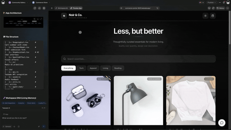
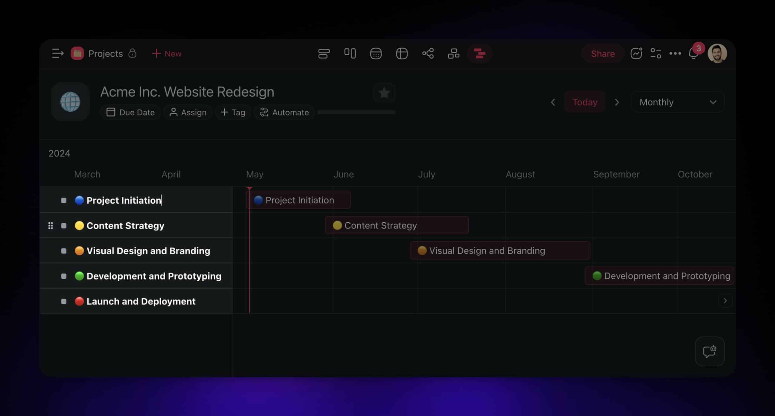
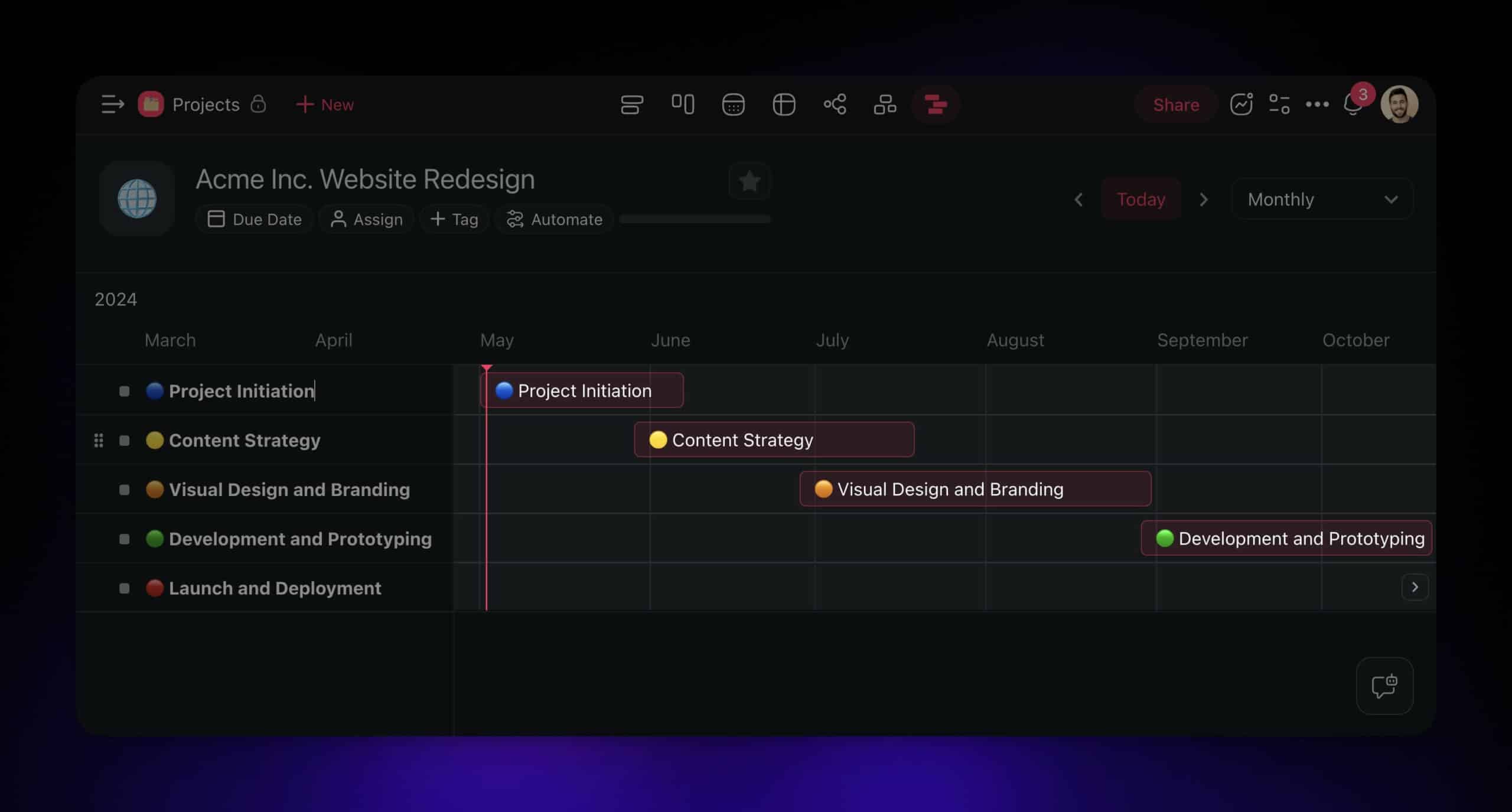
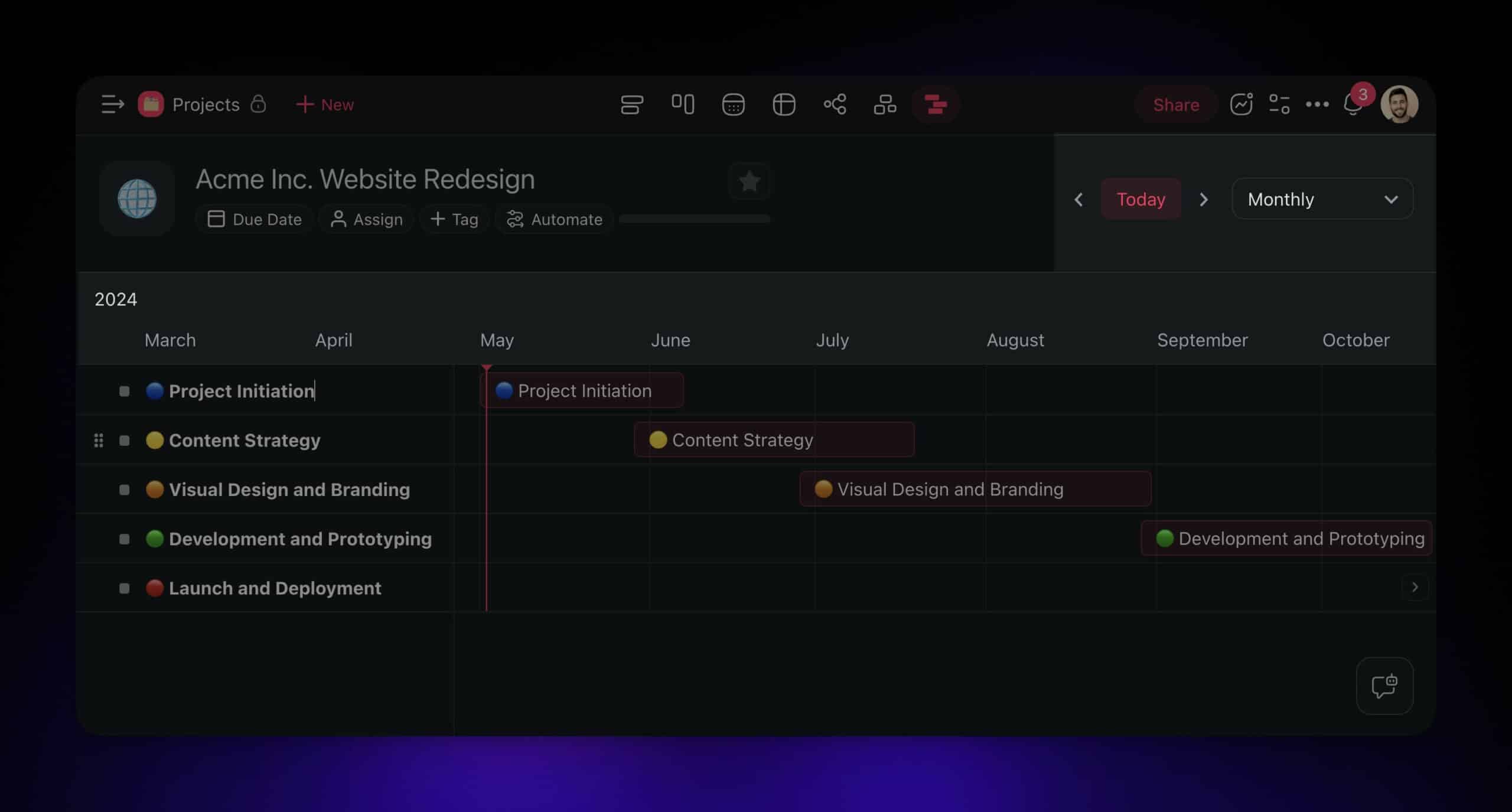
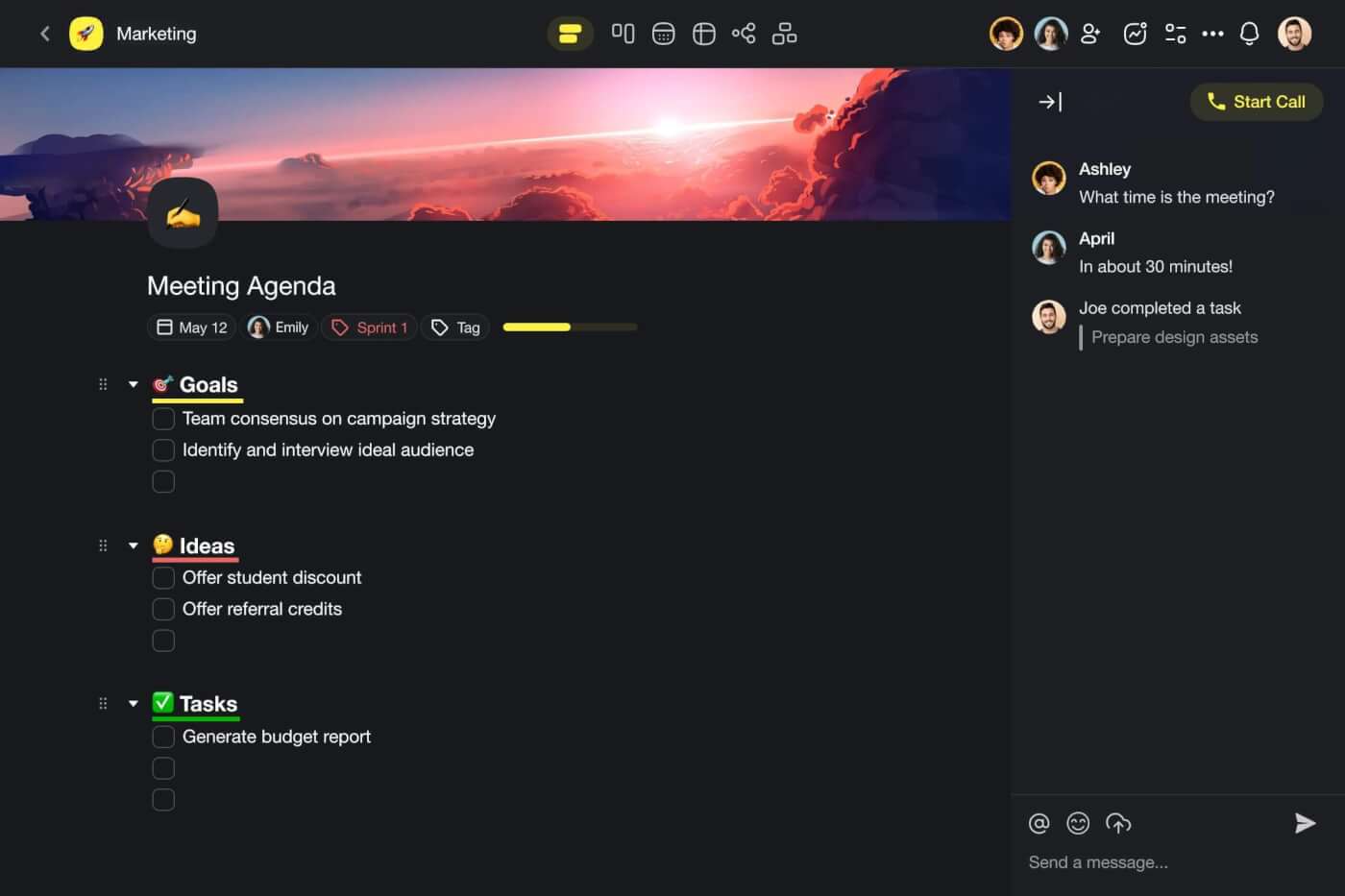
Creating a Gantt Chart Inside Taskade
Taskade is an AI-powered project management platform that gives you 7 ways to view the same project data. Creating a Gantt chart takes minutes, whether you build manually or let AI do it.
Create a Taskade account for free
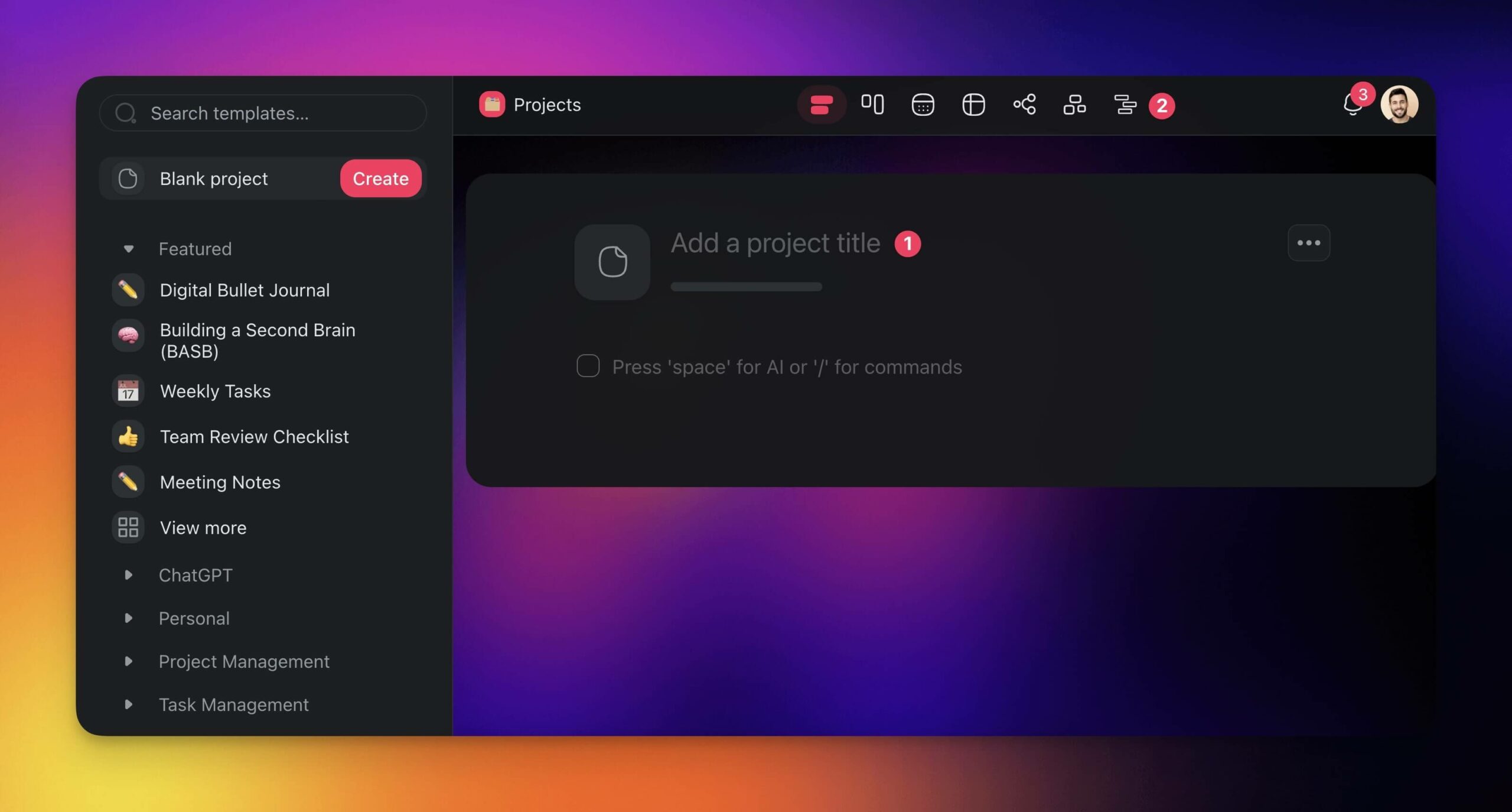
Step 1: Set Up a New Project
Create a project inside your workspace. Read our hierarchy structure guide to learn about workspace and project organization.
Click the New Project button in the top-right corner. Choose Start Blank or use one of the AI generation options.
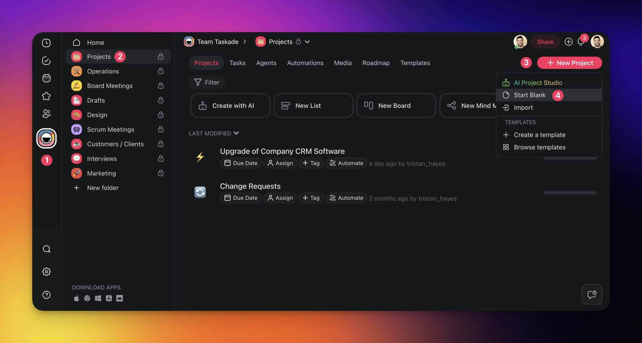
You are now in the project editor. Taskade stores projects in tree-shaped databases, which means you can transform them across all 7 views. We call this the Origami method.
To enable the Gantt Chart view:
- Type a name for your project
- Click the Gantt Chart button in the top navigation bar
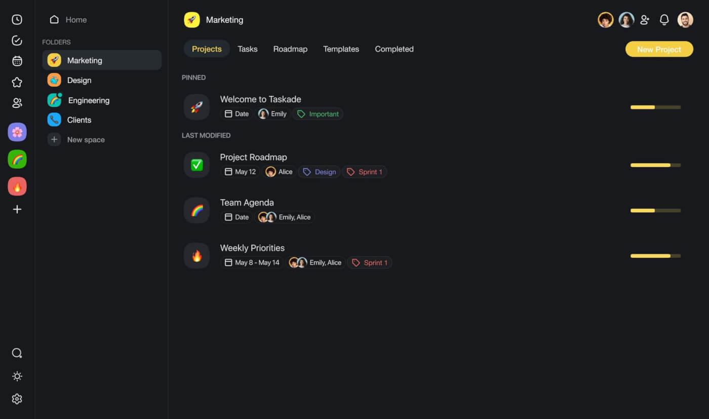
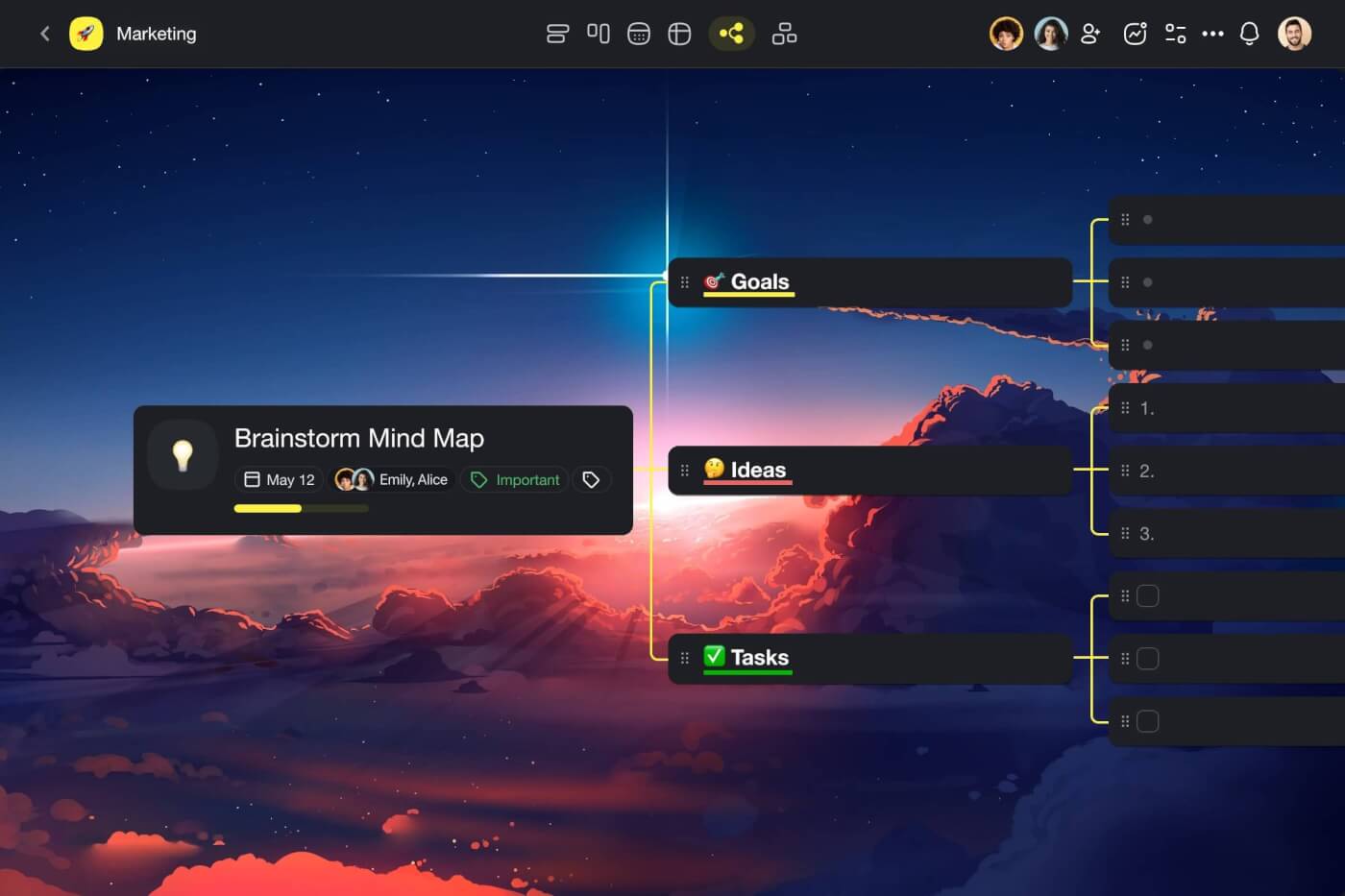
There are 7 project views in Taskade -- List, Board, Table, Mind Map, Org Chart, Calendar, and Gantt Chart. All views share the same data, so changes in one view appear instantly in all others.
Step 2: Add Tasks
Click the New task button and type task titles.
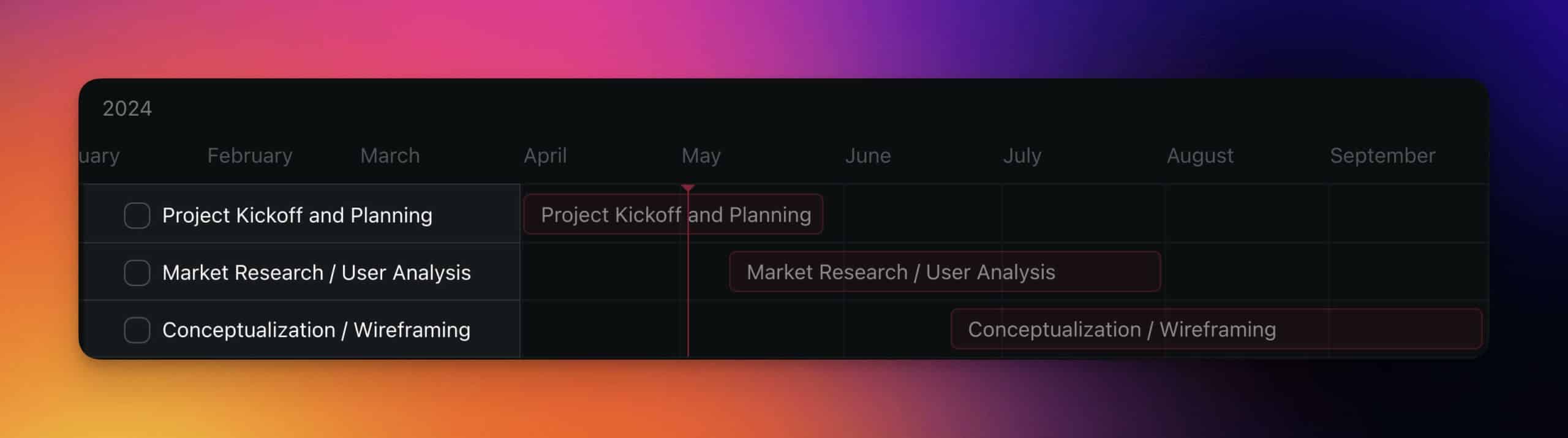
Find the appropriate start date on the timeline and click an empty space at the same level as your task on the left. Adjust duration by dragging the corners of timeline items.

Pro Tip: Swipe with two fingers on your trackpad or drag the timeline to navigate dates. Adjust the view using the time scale selector in the top-right.
Here is the final result:
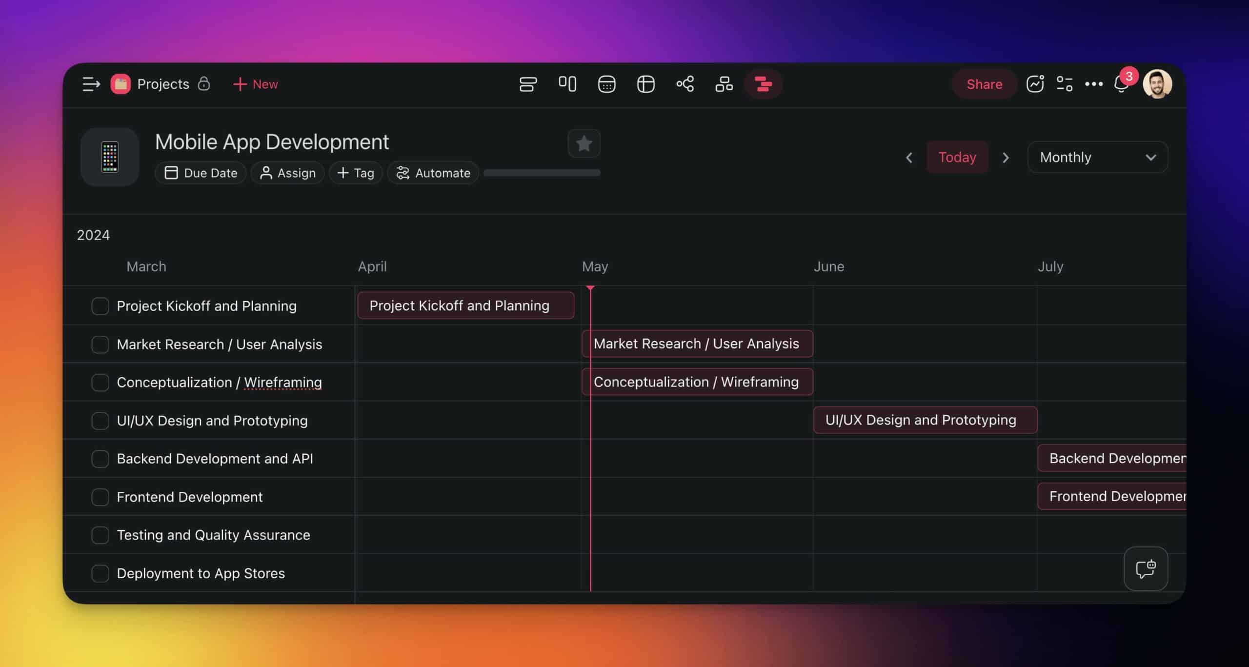
Step 3: Navigate and Customize
The Gantt Chart view includes several navigation features:
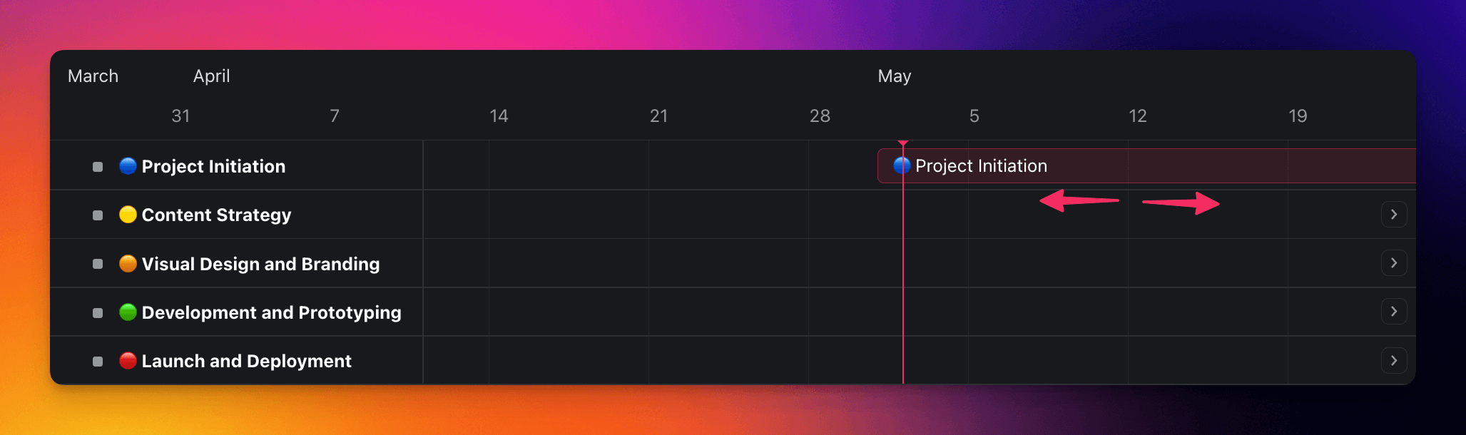
Today Marker -- The vertical line on the chart indicates the current date and provides a clear reference point for evaluating progress against the plan.
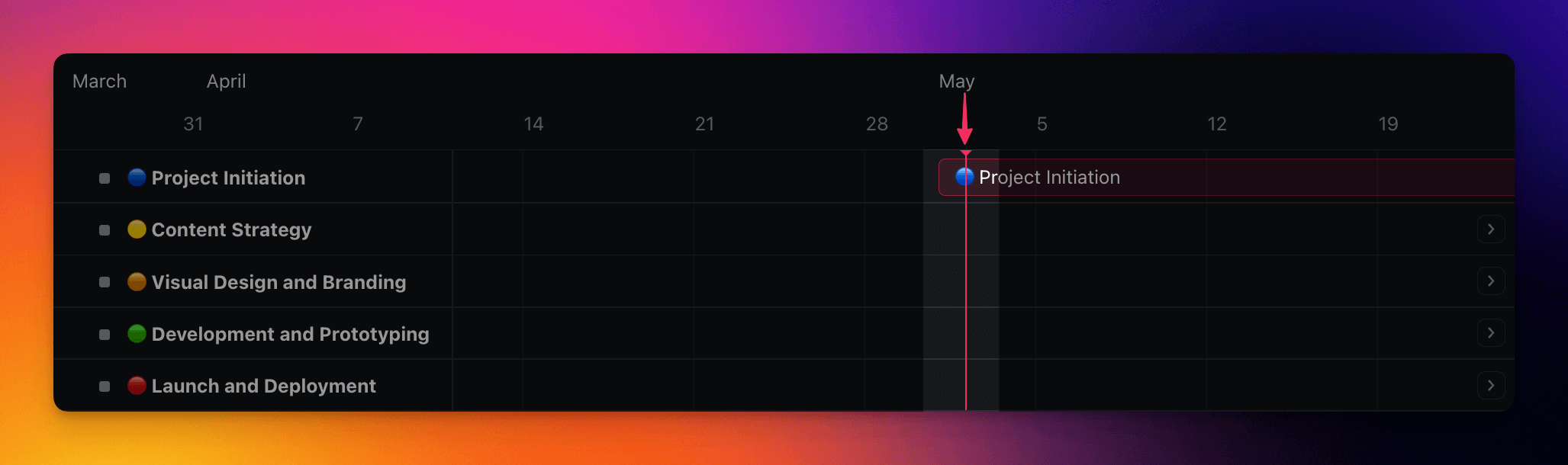
Seeker Arrows -- Located at the edges of the timeline, these buttons let you quickly jump to tasks, which is useful in longer projects.
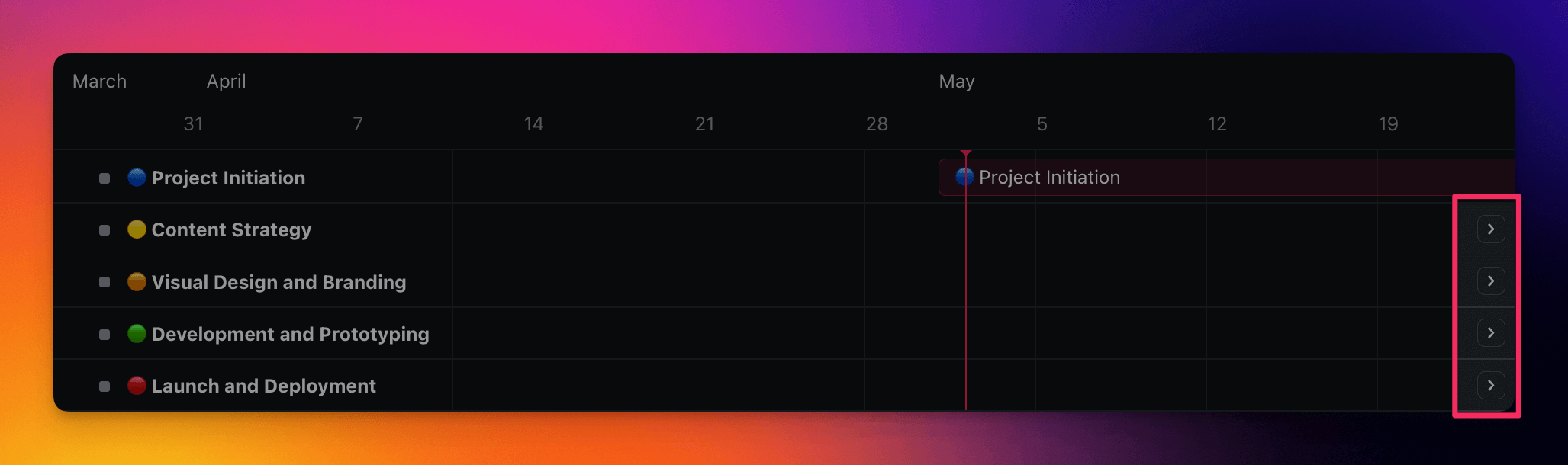
Drag and Drop -- Click and hold the center of a task bar and drag it left or right to reschedule.
AI-Powered Gantt Chart Generation
This is where Taskade separates from traditional Gantt chart tools. AI does not just display your data -- it generates, estimates, and optimizes your project timeline.
Watch this short introduction:
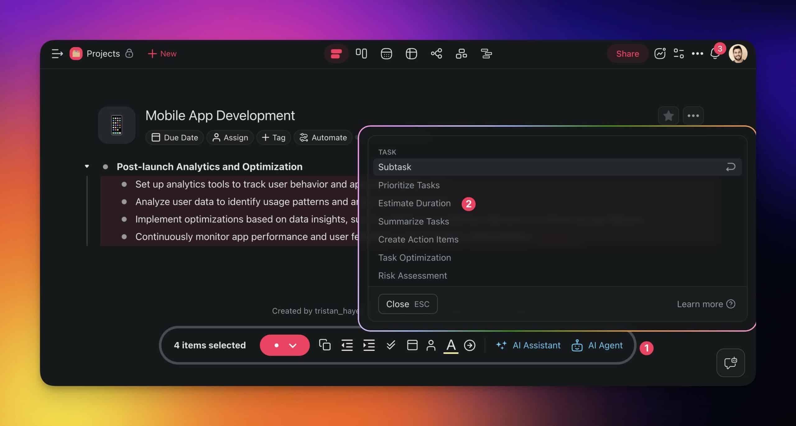
AI Duration Estimation
Select tasks in the project editor and use the /estimate duration AI command. Taskade AI analyzes the task description, considers common industry benchmarks, and provides realistic duration estimates for each item.
The /estimate duration command is part of the Task custom agent. Read our guide to custom AI agents to set up your own.
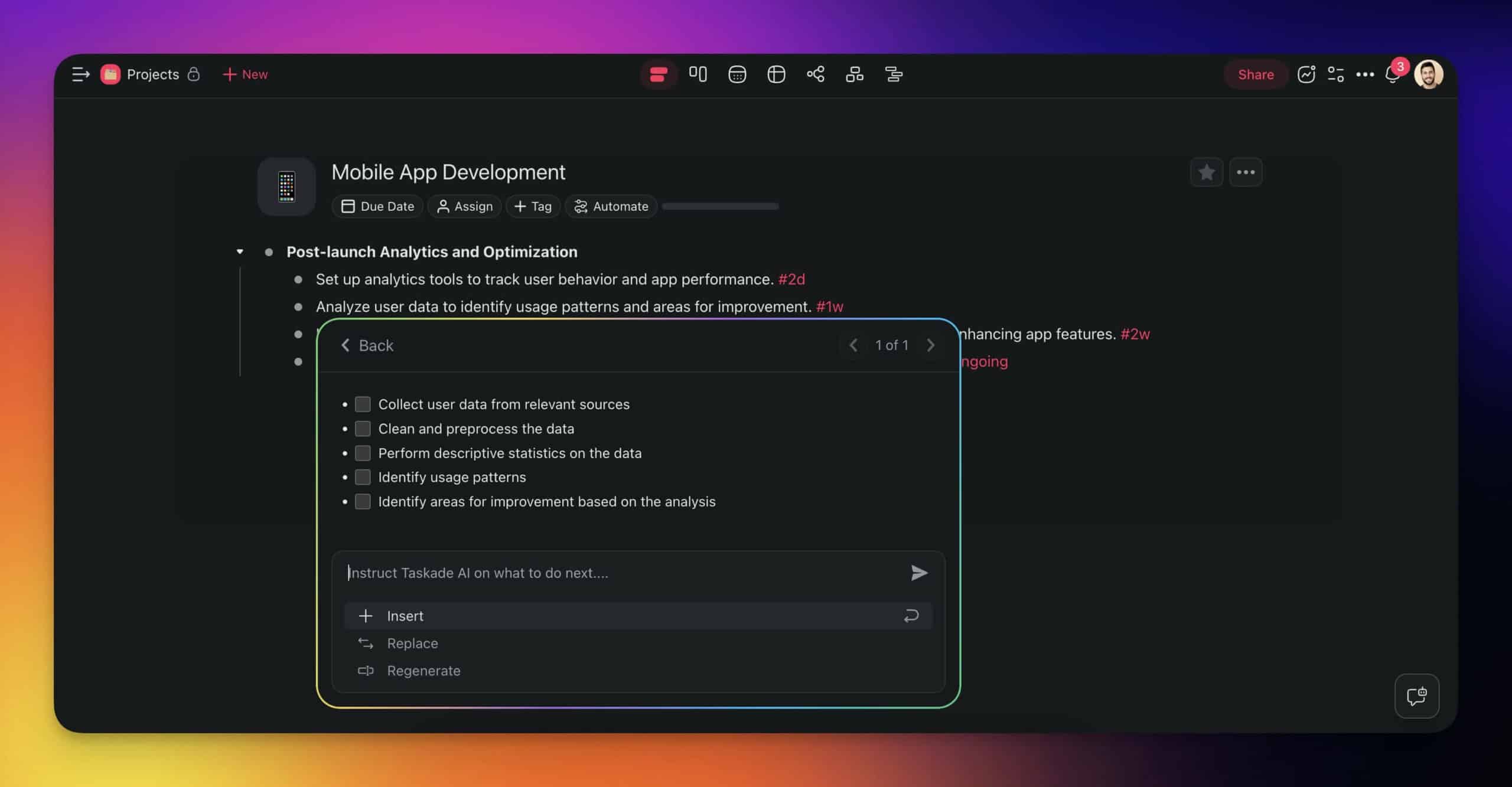
AI Task Decomposition
Break down high-level tasks into granular subtasks using the /subtask command. Select individual items or bulk-select the entire list and apply the command to all items at once.
Full AI Gantt Chart Generation
Taskade AI can generate complete Gantt charts from scratch. Describe your project -- objectives, deadlines, required resources, available team members -- and AI creates a structured timeline with tasks, dependencies, and duration estimates.
Example prompt:
"Create a Gantt chart for a product launch. The project includes market research (2 weeks), product design (3 weeks), development (6 weeks), testing (2 weeks), marketing prep (4 weeks, can start after design), and launch (1 week). Team of 5 people. Launch deadline is Q3 2026."
AI generates the full Gantt chart with:
- Tasks organized by phase
- Duration estimates refined from your descriptions
- Dependencies between sequential tasks
- Parallel workstreams where possible (e.g., marketing prep alongside development)
- Resource assignments across the team
Practical Applications of Gantt Charts by Industry
Gantt charts apply across every industry with project-based work. Here is how different sectors use them:
| Industry | Primary Use Case | Key Features Used |
|---|---|---|
| Software Development | Sprint planning, release timelines, feature dependencies | Subtask decomposition, dependency tracking, Board view for Kanban |
| Construction | Build schedules, contractor coordination, permit timelines | Critical path analysis, resource allocation, milestone tracking |
| Marketing | Campaign timelines, content calendars, launch coordination | Parallel workstreams, Calendar view, team assignments |
| Event Planning | Venue prep, vendor management, logistics coordination | Deadline tracking, dependency chains, checklist subtasks |
| Consulting | Client deliverable tracking, milestone management | Progress reporting, stakeholder visibility, Table view |
| Manufacturing | Production scheduling, supply chain management | Resource leveling, capacity planning, dependency types |
| Education | Curriculum planning, research project timelines | Phase-based planning, milestone tracking |
Gantt Chart Best Practices for 2026
| Practice | Why It Matters | How Taskade Helps |
|---|---|---|
| Start with milestones | High-level phases first, details later | AI generates project structure from goals |
| Use task hierarchies | Keeps the chart readable at any zoom level | Tree-shaped projects with collapsible subtasks |
| Track dependencies explicitly | Prevents scheduling conflicts | Visual dependency lines with drag-and-drop |
| Update regularly | Stale charts are worse than no chart | Automations flag overdue tasks |
| Use multiple views | Gantt for timeline; Board for status; Calendar for deadlines | 7 project views sharing the same data |
| Leverage AI estimates | Better than guessing task durations | /estimate duration command learns from project patterns |
| Share with stakeholders | Alignment prevents scope creep | Real-time sharing with role-based access (7 tiers: Owner through Viewer) |
Frequently Asked Questions
What is a Gantt chart and what is it used for?
A Gantt chart is a horizontal bar chart that visualizes a project schedule, showing tasks as bars along a timeline with bar length representing duration and position showing start/end dates. Named after Henry Gantt who popularized the format around 1910, Gantt charts are used for project planning, progress tracking, dependency management, resource allocation, and stakeholder communication. They are standard in construction, software development, event planning, and any project with sequential tasks.
How do you create a Gantt chart with AI?
In Taskade, describe your project objectives, deadlines, and resources in natural language and the AI generates a complete Gantt chart automatically. AI estimates task durations, identifies dependencies, and sequences activities optimally. You can also convert existing task lists into Gantt charts by switching to the Gantt view in any Taskade project. AI commands like /estimate duration and /subtask refine the timeline further.
What are the advantages and disadvantages of Gantt charts?
Advantages: clear visual timeline that stakeholders understand instantly, dependency tracking prevents scheduling conflicts, progress visibility at a glance, and resource allocation clarity. Disadvantages: can become unwieldy for large projects with hundreds of tasks, don't handle uncertainty well (fixed dates assume predictable durations), require constant updating to stay accurate, and favor sequential over iterative workflows.
How does Taskade compare to Microsoft Project for Gantt charts?
Taskade offers AI-generated Gantt charts integrated with 6 additional project views (List, Board, Calendar, Table, Mind Map, Org Chart), AI agents with 34 tools, real-time collaboration, and 100+ integrations. Microsoft Project provides enterprise-grade scheduling with advanced resource leveling and earned value management. Taskade starts free; Microsoft Project starts at $10/user/month. Taskade is better for teams wanting AI assistance and modern collaboration; MS Project suits enterprise PMOs with complex resource management needs.
How does Taskade compare to Smartsheet for Gantt charts?
Taskade combines AI-powered Gantt charts with 7 total project views, AI agents, and automation. Smartsheet offers spreadsheet-style project management with Gantt visualization, strong reporting, and enterprise governance. Taskade generates Gantt charts from natural language descriptions; Smartsheet requires manual data entry. Taskade pricing starts free with paid plans from $6/month; Smartsheet starts at $9/user/month with minimum seat requirements.
Can AI automatically generate Gantt charts from project descriptions?
Yes. Taskade AI generates complete Gantt charts from natural language project descriptions. Describe your objectives, deadlines, resources, and constraints, and AI creates a structured timeline with task dependencies, duration estimates, and resource assignments. AI can also break down existing high-level tasks into subtasks and estimate their durations using the /subtask and /estimate duration commands.
What are the 7 project views in Taskade?
Taskade offers 7 project views: List (hierarchical task management), Board (Kanban-style columns), Calendar (date-based planning), Table (spreadsheet-style data), Mind Map (visual brainstorming), Gantt Chart (timeline visualization), and Org Chart (hierarchical relationships). All views share the same underlying data, so changes in one view reflect instantly across all others.
What industries use Gantt charts most effectively?
Gantt charts are most effective in industries with sequential, phase-based projects: construction (build schedules and contractor coordination), software development (sprint planning and release timelines), event planning (venue, vendor, and logistics coordination), manufacturing (production scheduling and supply chain management), marketing (campaign timelines and content calendars), and consulting (client deliverable tracking and milestone management).
Wrapping Up: The Strategic Edge of Gantt Charts
Gantt charts have been a project management staple for over a century because they solve a fundamental problem: making complex schedules understandable at a glance.
In 2026, AI has transformed them from static visualization tools into dynamic, self-generating project plans. Taskade's combination of AI-powered Gantt generation, 7 project views, and 100+ integrations makes project scheduling faster and more accurate than ever.
Key takeaways:
- Gantt charts visualize project timelines, dependencies, and progress on a single canvas
- AI generates complete Gantt charts from natural language project descriptions
- Taskade offers 7 interconnected project views so you see the same data from multiple angles
- Compared to Microsoft Project and Smartsheet, Taskade provides AI generation and modern collaboration at a lower price point
- AI commands like /estimate duration and /subtask refine your timeline in seconds
- Automations and AI agents keep your Gantt chart updated as work progresses
Ready to build your first AI-generated Gantt chart?
Sign up for free to join the future of AI productivity
Read more:
- Project Management Basics
- Project Roadmaps Guide
- Gantt Charts vs Roadmaps
- Project Management Software Guide
- The Ultimate Guide to Task Automation
- AI Agent Builders Guide
- What Is a Project Timeline?