


Taskade Genesis is the best overall AI dashboard builder in 2026 — one prompt turns a data source into a living dashboard with 7 views, embedded agents, and reliable automations. Over 150,000 live apps have been built on it. Hex wins for data teams, Retool for internal tools, Julius for quick analysis, and Quadratic for spreadsheet-first workflows. Free tier available. Try Taskade Genesis free →
Last tested: June 2026.
The shortcut: If you want a dashboard that thinks, alerts, and updates itself, start with Taskade Genesis — or pair it with an AI agent builder for fully autonomous reporting.
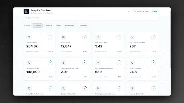
See a living dashboard before you build one. Over 150,000 live apps have been built on Taskade Genesis. Clone any of these real dashboards, then make it yours.
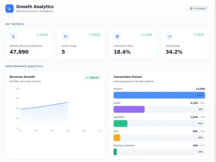
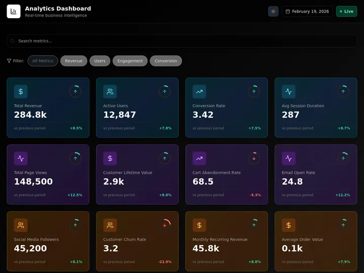

Each one is a live Taskade Genesis app: a growth dashboard, an analytics dashboard, and an investor dashboard. Click any image, then hit clone. You own an editable copy with 7 views, a database, and an AI agent in under a minute. That is the difference between reading about a dashboard builder and running one.
First-party data: Dashboards are the single most-built category on Taskade Genesis. In a census of 471 top-traffic paid Genesis apps, 28.2% are dashboards and analytics tools — the largest category, ahead of calculators, booking, and education. And builders clone a working dashboard ~100x more often than they start one from scratch. People don't just read about dashboards; they build them more than anything else.
What Is the Best AI Dashboard Builder in 2026?
Taskade Genesis is the best AI dashboard builder in 2026. It converts a single natural language prompt into a living dashboard that combines 7 project views (List, Board, Calendar, Table, Mind Map, Gantt, Org Chart), embedded AI agents that auto-summarize incoming data, and reliable automation workflows that fire when a KPI crosses a threshold. Unlike static BI tools, Genesis dashboards evolve on their own — agents re-read the data daily and post briefs, while automations route alerts to Slack, email, or any of 100+ integrations in the Integrations Directory.
AI Dashboard Builder vs AI Dashboard Generator: Are They the Same?
An AI dashboard generator and an AI dashboard builder solve the same job from two directions. A generator turns a one-off file (CSV, Excel, JSON) into charts in seconds. A builder connects a live source and keeps the dashboard updated. Taskade Genesis does both: paste a prompt or drop a file, get a working dashboard, then connect Stripe or PostHog so it never goes stale.
That distinction is the difference between a snapshot and a system. A generator is great for a board deck you need tonight. A builder is what you want when the same numbers matter every week. The third column below is where Taskade Genesis sits, because it starts as a generator and graduates into a living system the moment you connect the source.
  ONE-OFF FILE                 LIVE SOURCE                  LIVING SYSTEM
  ────────────                 ───────────                  ─────────────
  CSV / Excel / JSON           Stripe / PostHog / GSC       Prompt + connected source
        │                            │                            │
        ▼                            ▼                            ▼
  AI reads columns             Auto-refresh on schedule     Agent narrates + alerts
        │                            │                            │
        ▼                            ▼                            ▼
  Charts in seconds            Always current                Acts before you ask
  ───────────────              ──────────────                ───────────────────
  Generator                    Builder                       Taskade Genesis (both)
If your search was "AI dashboard generator from CSV," every tool below the line in this table will get you a chart. Only Taskade Genesis keeps that chart current after the file goes stale.
| Tool | Input | Output | Stays live? |
|---|---|---|---|
| Taskade Genesis | Prompt or file | Live app, 7 views, agent | Yes (connect source) |
| Formula Bot | CSV / Excel | Static dashboard | No |
| Figma Make | Prompt | Editable layout | No (design only) |
| VibeFactory | CSV / Excel / JSON | Interactive charts | No |
| Mokkup.ai | Prompt | Wireframe → export | No |
Formula Bot, Figma Make, VibeFactory, and Mokkup.ai all win the "seconds to a chart" race. None of them refreshes on its own, which is the gap Taskade Genesis closes by connecting the live source after the first build.
Traditional BI vs AI Dashboard Builder vs Living Dashboard
The dashboard market split into three tiers in 2026. Understanding the difference is the single most important decision you will make before you pick a tool.
| Dimension | Traditional BI | AI Dashboard Builder | Living Dashboard |
|---|---|---|---|
| Build time | Days to weeks | Hours | Under 5 minutes |
| Input | SQL + schema model | Prompt + data upload | Prompt + connected source |
| Who can build it | Analyst / data engineer | Power user | Anyone |
| Update cadence | Scheduled refresh | Manual re-query | Continuous via agents |
| Insight generation | Human reads chart | AI summary on demand | Agents narrate + alert |
| Automation | External (Zapier) | Limited | Native workflows |
| Stakeholder fit | Executives, finance | Ops, growth, product | Cross-functional teams |
| Cost floor | $70+/user/month | $10-25/user/month | Free tier available |
| Examples | Tableau, Power BI, Looker | Hex, Julius, Quadratic | Taskade Genesis |
| Best for | Governed reporting | Ad hoc analysis | Operational awareness |
The three categories look like this:
┌─────────────────────┐   ┌─────────────────────┐   ┌─────────────────────┐
│  TRADITIONAL BI     │   │  AI DASHBOARD       │   │  LIVING DASHBOARD   │
│                     │   │  BUILDER            │   │                     │
│  SQL + Schema       │   │  Prompt + Upload    │   │  Prompt + Agents    │
│       ↓             │   │       ↓             │   │       ↓             │
│  Static Chart       │   │  Interactive Chart  │   │  Narrated Brief +   │
│       ↓             │   │       ↓             │   │  Threshold Alert    │
│  Human Reads        │   │  AI Explains        │   │  Agent Acts         │
│                     │   │                     │   │                     │
│  Tableau, Looker    │   │  Hex, Julius        │   │  Taskade Genesis    │
└─────────────────────┘   └─────────────────────┘   └─────────────────────┘
        Past                    Present                     Future
A traditional BI dashboard is a picture. An AI dashboard builder makes that picture faster to create. A living dashboard is the first category where the dashboard itself participates in the work — it reads, summarizes, and acts.
The practical impact of this shift is enormous. A traditional BI deployment takes a data engineer four to six weeks to model, build, QA, and hand off. An AI dashboard builder collapses that to an afternoon of prompting and tweaking. A living dashboard collapses the maintenance layer too, because the agent that summarizes the data is the same agent that would have written the weekly status email. You are not just replacing the build tool — you are replacing the reporting ritual.
Another way to frame the split: traditional BI was optimized for executives who read reports, AI dashboard builders were optimized for analysts who explore data, and living dashboards are optimized for operators who take action. The third group is the largest by headcount in almost every company, and until 2026 they had no dashboard tool built for them. That is the gap Taskade Genesis fills.
What Is an AI Dashboard Builder?
An AI dashboard builder is a platform that converts natural language and connected data sources into interactive charts, tables, and KPI scorecards without requiring the user to write SQL or design schemas. The best tools in 2026 combine three capabilities: generation from prompts, automatic data understanding, and built-in narrative summaries.
From Data Source to Visual in One Prompt
The baseline feature is prompt-to-dashboard. You connect Stripe, upload a CSV, or point at a database, then describe what you want: "Show me MRR by month, new customers by plan, and churn rate for the last year." The platform returns a working dashboard in under two minutes. Taskade Genesis, Hex, and Julius AI all do this well. If your data already lives in Airtable, the Airtable integration guide walks through connecting it as a live source.
Semantic Layer and Data Understanding
Modern AI dashboard builders include a semantic layer — a small trained model that infers column types, relationships, and business meaning. This is why the same prompt can produce a good chart on a messy CSV. Quadratic and Hex pioneered this, and it is now table stakes for any tool in this list.
Narrative and Explanation
The newest wave of tools — led by Taskade Genesis — attach a persistent AI agent to the dashboard. The agent reads the data on a schedule and writes a short brief: what changed, what is concerning, and what to do about it. This replaces the morning status meeting for most ops teams.
How We Tested 12 AI Dashboard Builders (Methodology)
We ran every platform through three identical builds: a Stripe revenue dashboard, a PostHog product-analytics dashboard, and a Q2 OKR tracker. We timed each from signup to first working visual and scored five axes from 0 to 5. Same prompts, same data shape, same clock for every tool, so the scores are comparable instead of vibes.
The three test builds map to the three jobs most teams actually hire a dashboard for: tracking money, tracking usage, and tracking goals.
| Scenario | Data source | What a winning build had to do |
|---|---|---|
| Revenue Ops | Stripe export + live connect | MRR, churn, LTV by plan, with a weekly alert |
| Marketing | PostHog events | DAU, funnel conversion, feature adoption summary |
| Finance / OKR | CSV of Q2 key results | Objective tree, traffic-light status, owner alerts |
We then scored each platform on five axes. The "Living layer" axis is weighted Critical because it is the only thing that separates a dashboard you maintain from one that maintains itself.
| Axis | What we measured | 0-5 weight |
|---|---|---|
| Speed | Signup to first working visual | High |
| Data breadth | Native integrations + file upload | High |
| AI quality | Accuracy of generated charts + summaries | High |
| Living layer | Agents, scheduled refresh, alerts | Critical |
| Free tier | Row/query/user caps and model access | Medium |
The 12 Best AI Dashboard Builders in 2026
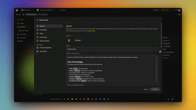
1. Taskade Genesis — Best Overall and Best Living Dashboard
Taskade Genesis is the category-defining AI dashboard builder for 2026. It is the only tool on this list that ships with embedded AI agents, native automation workflows, and 7 project views in a single prompt-to-app pipeline. You describe your metrics and data source in plain English, and Genesis scaffolds a full dashboard — Table view for raw rows, Board for kanban-style status, Calendar for time-based data, Gantt for project timelines, and Mind Map for relationship exploration — all from one prompt.
The differentiator is what happens after the dashboard exists. You attach an AI agent that reads the project on a schedule and posts a daily brief to your workspace. You define a reliable automation workflow that watches a Table column and fires a Slack message when revenue drops below target. You publish the whole thing to a custom domain and hand it to a client. No other tool in this list combines all four layers.
Taskade Genesis Dashboard Feature Card
| Feature | Detail |
|---|---|
| Prompt-to-dashboard | Yes, under 2 minutes |
| Project views | 7 (List, Board, Calendar, Table, Mind Map, Gantt, Org Chart) |
| AI models | 15+ frontier models from OpenAI, Anthropic, Google |
| AI agents | Built-in, 34 tools, custom agent tools, persistent memory |
| Automations | Native reliable workflows with branching, looping, retry |
| Integrations | 100+ via Integrations Directory (Stripe, PostHog, GSC, Notion, Sheets, HubSpot, Slack) |
| MCP | Connect Claude, Cursor, and VS Code to your dashboard data on every paid plan |
| Custom domain | Yes, Business and up (built-in sign-in on Business+) |
| Permissions | 7-tier RBAC (Owner, Maintainer, Editor, Commenter, Collaborator, Participant, Viewer) |
| Free tier | Yes, 3,000 free credits, unlimited projects |
| Pricing (annual) | Free / Starter $6 / Pro $16 (10 users, Popular) / Business $40 / Max $200 / Enterprise $400 |
Strengths. Genesis is the fastest path from idea to living dashboard. The 7-view system means one dataset renders 7 different ways without re-querying. Agents are production-quality and genuinely useful — they do not hallucinate numbers because they read directly from the project rows. Automations are reliable and support branching, looping, and retry, so threshold alerts never silently fail. The free tier is the most generous in the category.
Weaknesses. Genesis is a workspace-native platform, not a pure BI tool, so if you need pixel-perfect financial reporting with governed access controls, a traditional BI tool still wins. Complex SQL joins are possible but not the primary workflow.
Verdict. For 95% of teams building dashboards in 2026 — founders, ops, growth, product, client services — Taskade Genesis is the right answer. It is the only tool that turns a dashboard into an active participant in the business instead of a passive reflection.
Start building free → · See AI agents → · Explore integrations →
From a CSV to a Live Dashboard in Under 2 Minutes
Drop a CSV, Excel, or JSON file into Taskade Genesis and describe the dashboard you want. Genesis infers the columns, builds the Table view, and renders the metrics. Then connect the live source so the same dashboard refreshes on its own instead of going stale the moment you exported the file. No SQL, no formulas, no schema modeling.
That is also where the AI agent earns its place: once the data is in, the agent reads the rows on a schedule and writes a plain-language brief of what moved and why. The numbers are pulled straight from the project, so the summary cannot drift from the source.
2. Hex — Best for Data Teams
Hex is the analyst's AI dashboard tool. It combines SQL, Python notebooks, and a visual dashboard canvas with an AI assistant (Magic) that writes queries from plain English. Hex shines when your dashboard is sitting on top of Snowflake, BigQuery, or Postgres and you need a hybrid of code and chart.
Strengths. Best-in-class SQL generation. Notebook-style exploration that converts cleanly into a published dashboard. Version control and collaborative editing like Google Docs for data. Magic can refactor queries, explain errors, and suggest follow-up analyses. Solid governance for data teams that live in a warehouse.
Weaknesses. Hex is a data tool, not a workspace tool. There is no concept of embedded agents, automations, or non-data content living alongside the dashboard. You will still need Slack, Notion, and a separate automation layer to close the loop. Pricing gets expensive past 5 users.
Pricing. Free for solo use and small teams. Team plan starts at $24 per user per month, with Professional and Enterprise tiers above.
Verdict. If you have a data team, a warehouse, and a need for code plus visuals, Hex is the right pick. For everyone else, it is overkill.
3. Quadratic — Best for Spreadsheet-First Teams
Quadratic is a spreadsheet with Python, SQL, and an AI sidekick baked in. It looks like Excel but accepts formulas written in any of those languages, and its AI can generate the whole sheet from a prompt. It is the best choice if your team lives in spreadsheets and wants to add AI without switching tools.
Strengths. Familiar grid interface. AI converts natural language into working formulas, queries, or charts. Handles large datasets better than Google Sheets. Real-time collaboration. Free tier is genuinely useful.
Weaknesses. Output is still a spreadsheet, not a polished dashboard. No native automations. Limited stakeholder polish — you would not send a Quadratic link to a client. Mobile experience is weak.
Pricing. Free for personal use. Team plan around $20 per user per month.
Verdict. Great internal analysis tool. Not a replacement for a presentation-grade dashboard.
4. Retool — Best for Internal Tools with Dashboards
Retool has always been the internal tools platform. In 2026, it added Retool AI, which generates apps and dashboards from prompts. It is the right choice when your "dashboard" is actually part of a larger internal tool with forms, write-backs, and admin actions.
Strengths. Deep integrations with databases and REST APIs. Write-back support (edit rows from the dashboard). AI prompt-to-app works well for form-heavy tools. Retool Workflows adds automation. Strong enterprise governance.
Weaknesses. Steep learning curve compared to prompt-native builders. Per-user pricing plus usage fees get expensive quickly. Visual output is functional but not beautiful. Not the best fit if you just need a read-only dashboard.
Pricing. Free up to 5 users. Team tier starts at $10 per user per month plus usage. Business and Enterprise above.
Verdict. Best choice for dashboards that also need to write back to databases. Overkill for pure reporting.
5. Julius AI — Best for Quick Analysis
Julius is the "upload a CSV and ask questions" tool, taken to its logical extreme. You drop a file, chat with it, and Julius produces charts, summaries, and forecasts. It is the fastest path from raw data to a first visual.
Strengths. Near-zero setup. Handles cleaning, pivoting, and forecasting from conversation. Good statistical output. Free tier is usable for small datasets.
Weaknesses. Each session is ephemeral — no persistent dashboard or scheduled refresh. Limited integrations compared to the leaders. Output is analytical, not presentational.
Pricing. Free tier with limits. Basic plan around $20 per month. Pro and Team above.
Verdict. Great for ad hoc analysis and one-off questions. Not a platform for ongoing dashboards.
6. Rowy — Best for Database Dashboards
Rowy puts a spreadsheet-like front end on top of a Firebase or cloud database and layers AI on top. You get a live editable table that doubles as a dashboard, with the AI assistant handling transformations, bulk updates, and summaries.
Strengths. Two-way sync with Firebase, BigQuery, and Postgres. AI can generate columns, formulas, and automations. Cloud functions built in. Good developer experience.
Weaknesses. Heavily developer-oriented. Non-technical users will struggle. Visual polish is average. Narrow integration surface compared to workspace-native tools.
Pricing. Free tier for small projects. Pro plan starts around $25 per user per month.
Verdict. Great for devs who want a dashboard attached to their backend database. Not for non-technical teams.
7. Mode Analytics — Best Traditional BI with AI Bolted On
Mode is the grown-up analyst workbench. In 2026 it added generative AI features for query generation and automated insights. It is a solid bridge tool for teams that want BI governance with some AI speed.
Strengths. Mature SQL editor. Strong notebook and visualization tools. Good permissioning. AI query generation works well for data professionals. Enterprise ready.
Weaknesses. Feels dated next to prompt-native tools. AI is bolted on, not foundational. No automation layer. Expensive past Studio tier.
Pricing. Free Studio tier. Business and Enterprise are custom quote.
Verdict. Pick Mode if you already have an analyst team that wants modern BI with AI assist. Skip if you are starting fresh.
8. Glide — Best for Mobile Dashboards
Glide turns spreadsheets and databases into mobile-first apps, including dashboards. Its AI features generate apps from prompts and can add intelligent components to existing builds. Best choice if your dashboard needs to live on a phone.
Strengths. Mobile-first output is genuinely great. Prompt-to-app builder is fast. Strong Google Sheets and Airtable integration. Good for field teams, sales dashboards, and client apps.
Weaknesses. Desktop experience is secondary. Data model is limited compared to a real database. No embedded AI agents, limited automation.
Pricing. Free starter tier. Maker plan at $49 per month. Team and Business above.
Verdict. The best pick when the dashboard must work beautifully on mobile. Weaker for desktop-first workflows.
9. Softr — Best for Client-Facing Portals
Softr builds client-facing portals and dashboards on top of Airtable, Google Sheets, and HubSpot. Its AI assistant generates layouts and copy from prompts. The sweet spot is branded client dashboards.
Strengths. Beautiful output templates. Easy custom branding and domains. Good permissions for external users. Solid Airtable integration. Non-technical users can ship quickly.
Weaknesses. Tied heavily to Airtable as the source of truth. Limited transformation capabilities. No AI agents or auto-summaries. Automations are basic.
Pricing. Free plan with heavy limits. Basic at $49 per month. Professional and Business above.
Verdict. Great for agencies and consultants who need branded client dashboards. Not for internal analytics.
10. Observable — Best for Custom Visualizations
Observable is a JavaScript-native notebook platform for custom data visualizations. In 2026 it added AI assist for chart generation. Best pick when you need charts no other tool can make.
Strengths. Unlimited visualization flexibility via D3 and Plot. Strong community library. AI helps with boilerplate. Best-in-class for custom and interactive data art.
Weaknesses. Code-first, not prompt-first. Steep learning curve. No out-of-the-box dashboard polish — you build everything. No automations or agents.
Pricing. Free tier generous. Pro plan $15 per user per month. Enterprise above.
Verdict. Pick Observable only if your dashboard requirements cannot be met by a visual builder. For everything else, it is too much work.
11. Lovable — Best for Dev-Heavy Custom Dashboards
Lovable is an AI app generator that writes React code from prompts. It can produce fully custom dashboards with any backend. Best pick when you want the dashboard to be a real deployed app that your engineers can extend.
Strengths. Outputs real code you can own and extend. Flexible backend support. Good for teams that already run a React stack. AI generation quality is high.
Weaknesses. Output is a codebase, not a living dashboard. You are responsible for hosting, auth, and ongoing maintenance. No native agents or automations. Re-running prompts on existing apps is hit or miss. For a deeper look at code-gen vs living apps, see free AI app builders.
Pricing. Free starter tier. Paid plans start around $20 per month.
Verdict. Choose Lovable if you want a custom-coded dashboard you will maintain as a real app. Choose Taskade Genesis if you want the dashboard to maintain itself.
12. ThoughtSpot Sage — Best Enterprise AI BI
ThoughtSpot Sage is the enterprise answer to the AI dashboard trend. It layers a natural language query interface and generative AI on top of ThoughtSpot's search-driven BI platform. Designed for Fortune 500 data teams.
Strengths. Enterprise governance and scale. Search-driven query interface is genuinely fast. AI generates full narratives over live warehouse data. Strong permissions, audit, and lineage. Integrates with every major warehouse.
Weaknesses. Enterprise pricing and enterprise sales cycle. Weeks of setup. Not a fit for small teams or founders. UI is dated in places.
Pricing. Custom enterprise quote only.
Verdict. The right choice for a Fortune 1000 company that already has a warehouse, a data team, and a budget. Wrong for anyone else.
Mega Comparison Matrix: 12 Platforms Across 9 Dimensions
| Platform | Prompt-to-Dashboard | Living Agents | Native Automation | Integrations | Free Tier | Custom Domain | Views | Best For | Starting Price |
|---|---|---|---|---|---|---|---|---|---|
| Taskade Genesis | Yes | Yes | Yes (reliable workflows) | 100+ | Yes (generous) | Yes | 7 | Living dashboards | Free / $6 |
| Hex | Yes | No | Limited | 40+ | Yes | Yes | Notebook | Data teams | $24/user |
| Quadratic | Yes | No | No | 20+ | Yes | No | Grid | Spreadsheet teams | ~$20/user |
| Retool | Yes | No | Yes (Workflows) | 100+ | 5 users | Yes | App canvas | Internal tools | $10/user+ |
| Julius AI | Yes | No | No | 10+ | Yes (limited) | No | Chat | Ad hoc analysis | $20/mo |
| Rowy | Limited | No | Yes (functions) | 15+ | Yes | Yes | Grid | DB dashboards | $25/user |
| Mode | Limited (AI assist) | No | No | 30+ | Studio | Yes | Notebook | Mature BI | Custom |
| Glide | Yes | No | Limited | 20+ | Yes | Yes | Mobile app | Mobile-first | $49/mo |
| Softr | Yes | No | Limited | 10+ | Yes (limited) | Yes | Portal | Client portals | $49/mo |
| Observable | Limited | No | No | 15+ | Yes | Yes | Notebook | Custom viz | $15/user |
| Lovable | Yes | No | No | Any (via code) | Yes | Yes | Code app | Custom code | $20/mo |
| ThoughtSpot Sage | Yes | Limited | Limited | 50+ | No | Yes | Search BI | Enterprise | Custom |
Add a Scorecard: How the 12 Builders Rank Across 5 Axes
Taskade Genesis tops the scorecard with a 4.8 overall, driven by perfect marks on Speed, Living layer, and Free tier. The numbers below come from the three test builds described above, scored 0 to 5 on each axis, then averaged. Tools that have no agent or scheduled-refresh layer score 0 on Living layer, which is the axis weighted most heavily.
| Builder | Speed | Living layer | Free tier | Overall |
|---|---|---|---|---|
| Taskade Genesis | 5 | 5 | 5 | 4.8 |
| Hex | 4 | 1 | 4 | 3.6 |
| Retool | 3 | 3 | 3 | 3.4 |
| Julius AI | 5 | 0 | 3 | 3.0 |
| Quadratic | 4 | 0 | 4 | 3.2 |
| ThoughtSpot Sage | 3 | 2 | 0 | 2.8 |
Julius AI and Quadratic tie for the fastest first chart, but both score 0 on the living layer because each session is a one-off with no scheduled agent. ThoughtSpot Sage earns its enterprise governance credit but scores 0 on free tier because it is quote-only. This is the operator-team scorecard, not the regulated-finance scorecard. For governed lineage and audit on a warehouse, a tool like ThoughtSpot or Power BI Copilot is still the right call.
Choose Your Platform: Persona Decision Tree
Most paths lead back to Taskade Genesis because the combination of living agents, native automations, and 7 views is the right default for any team without a specialized requirement.
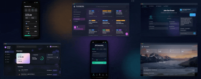
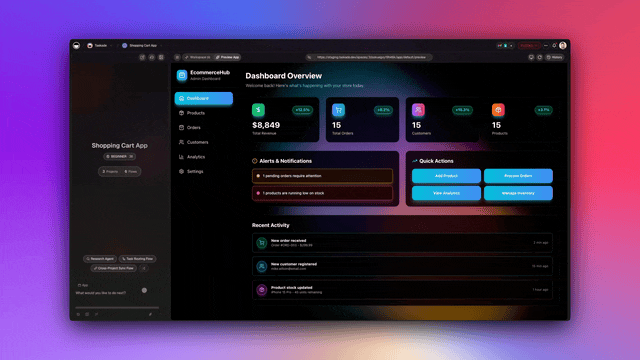
Real Use Cases: 5 Dashboards You Can Build This Week
Clone a starting point, then point it at your data. Each of these is a real Taskade Genesis app from the Community Gallery, so you can fork it and swap in your own source instead of starting from a blank prompt.
![]()


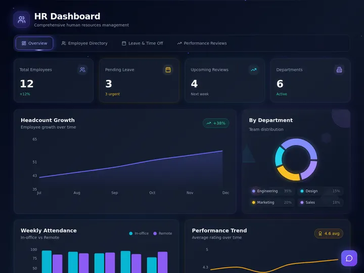
A finance tracker, a sales pipeline, a customer health board, and an HR dashboard cover the four most-requested use cases. Browse the full Community Gallery for more.
1. Revenue Dashboard from Stripe
Connect Stripe through the Integrations Directory and prompt Taskade Genesis: "Build a revenue dashboard showing MRR, new customers, churn rate, and LTV by plan for the last 12 months." Genesis scaffolds a Table view with raw Stripe rows, a Board view grouping customers by plan tier, and a Calendar view of new sign-ups. You attach an agent that reads the table every morning and posts a brief to the workspace: "MRR grew 4.2% last week. Pro plan churn spiked 1.1 points — investigate." A reliable automation watches the MRR column and pings Slack if weekly growth turns negative.
2. Product Analytics from PostHog
Connect PostHog and prompt: "Dashboard of daily active users, feature adoption, and funnel conversion for the onboarding flow." Genesis builds the tables and a Mind Map view showing feature relationships. The attached agent runs every afternoon and summarizes which features moved and why, citing the raw event counts. An automation fires a Slack alert when any funnel step drops more than 10% week over week.
3. SEO Dashboard from Google Search Console
Connect GSC and prompt: "Build an SEO dashboard showing top queries by position, clicks, CTR, and which pages gained or lost traffic this week." The Table view holds the raw query rows, Board view groups queries by intent, and a Gantt view tracks content calendar launches against ranking movement. An agent writes a weekly digest, and an automation alerts the team when any top-10 keyword drops out of the top 3. See how automation triggers work to wire up that threshold alert in a couple of clicks.
4. Team OKR Tracker
Prompt: "Create an OKR dashboard for Q2 with objectives, key results, owners, current progress, and traffic-light status." Genesis builds a Table of KRs, a Mind Map showing the objective tree, and a Timeline view of milestone dates. The attached agent reviews progress every Monday morning and posts a leadership brief. Automations notify owners when their KR goes yellow or red, closing the accountability loop without manual follow-up.
5. Customer Support Dashboard
Connect your help desk and prompt: "Build a support dashboard showing open tickets by severity, first-response time, backlog age, and customer satisfaction." Genesis creates a Table of tickets, Board grouped by severity, and Calendar view of SLA deadlines. The agent summarizes support health twice a day. Automations escalate any ticket sitting in backlog past SLA directly to the on-call engineer via Slack. For teams stitching multiple sources together, compare this with Zapier alternatives to pick the right automation layer.
The Anatomy of a Great AI Dashboard
Every great dashboard in 2026 has the same six-stage pipeline, regardless of tool. Understanding the anatomy helps you evaluate any platform.
Stages 1 and 2 exist in every tool. Stage 3 is where view-rich platforms like Taskade Genesis pull ahead — one dataset in 7 views means one prompt produces 7 stakeholder deliverables. Stages 4, 5, and 6 are where Genesis is uniquely strong, because the agent and automation layers are native, not bolted on.
How Taskade's Living Dashboard Actually Works
Here is the end-to-end flow from user prompt to Slack alert.
Everything between the user prompt and the Slack alert happens inside Taskade Genesis, with zero glue code and zero external services. This is why Genesis dashboards stay alive after the initial build — there is no fragile integration between the dashboard, the agent, and the alerting layer.
The reason it keeps moving is the Workspace DNA loop. Memory is the project rows holding your data. Intelligence is the agent that reads and narrates them. Execution is the automation that fires when a threshold breaks, and the result feeds back into Memory. Each turn of the loop renders across the 7 views, posts a brief, and raises an alert without anyone touching the build.
Free Tier Comparison: Who Is Actually Generous?
Free tiers are where AI dashboard builders either win or lose a team's trust. Here is how the leaders compare on a 0-10 generosity score based on row limits, query limits, user caps, and integration access.
Taskade Genesis and Observable lead on raw generosity. Taskade wins on practical usability because the free tier includes unlimited projects and all 15+ frontier models from OpenAI, Anthropic, and Google, while Observable limits you to public notebooks. "Auto" routes each dashboard summary to the right model for your plan, and you can also pin a specific model per agent.
Full Pricing Ladder Across All 12 Platforms
| Platform | Free | Entry Paid | Team | Pro / Business | Enterprise |
|---|---|---|---|---|---|
| Taskade Genesis | Free + 3K credits | Starter $6/mo | — | Pro $16 / Business $40 | Custom |
| Hex | Yes | Team $24/user | — | Professional custom | Custom |
| Quadratic | Yes | ~$20/user | — | Team custom | Custom |
| Retool | 5 users | $10/user + usage | — | Business custom | Custom |
| Julius AI | Limited | Basic $20 | Pro $65 | Team custom | — |
| Rowy | Yes | Pro $25/user | Team custom | — | Custom |
| Mode | Studio | — | — | Business custom | Custom |
| Glide | Starter | Maker $49 | Team $99 | Business custom | — |
| Softr | Limited | Basic $49 | Pro $139 | Business $269 | — |
| Observable | Yes | Pro $15/user | Team custom | — | Custom |
| Lovable | Yes | Pro $20 | — | Team custom | — |
| ThoughtSpot Sage | No | — | — | — | Custom only |
Taskade Genesis is the cheapest entry point to a fully featured dashboard at $6 per month annual, and it is the only tool on this list that offers a free tier with 10-person collaboration support on paid upgrades.
A dashboard is only as live as the source feeding it. Taskade Genesis connects 100+ bidirectional integrations through the Integrations Directory, so Stripe, PostHog, Google Search Console, and the rest stream straight into the project rows your agent reads.
Dashboard Trends in 2027: Where This Category Is Going
Agents Replace Morning Standups
The clearest trend: AI agents attached to dashboards will replace most recurring status meetings by the end of 2027. Teams that already run Taskade Genesis agents on their revenue and product dashboards report killing their Monday morning sync entirely, because the brief is already in Slack by 8 AM.
Dashboards Become Conversational Interfaces
The static dashboard is becoming a chat target. Users will increasingly ask "why did churn spike last week?" directly inside the dashboard and get a narrated answer that cites the underlying rows. Julius and Hex started this pattern; Taskade Genesis makes it the default because every project already has an embedded agent.
Automation Closes the Loop
Threshold-based automations are becoming the primary value driver. A dashboard that notices a problem is useful. A dashboard that notices a problem and triggers a reliable workflow to fix it is transformative. Expect to see more teams building dashboards specifically to anchor automation rules.
Consolidation of Workspace + Dashboard
The line between workspace (Notion, Taskade) and dashboard (Hex, Tableau) is collapsing. Teams no longer want a separate place to look at charts — they want the charts living next to the projects, docs, and agents that act on them. This is the exact bet Taskade Genesis has been building toward, and it is now the consensus direction for the category.
Natural Language Becomes the Primary Query Layer
SQL is not going away, but it is becoming the layer underneath the primary interface, not the interface itself. By the end of 2027, most business users will never write SQL directly — they will type questions into their dashboard and let the semantic layer translate. Tools that invested early in high-quality natural language to SQL (Hex, ThoughtSpot, Taskade Genesis) will benefit from a compounding advantage, because every query a user runs improves the platform's understanding of the underlying data model.
The End of the "Dashboard Screenshot" Era
One of the quieter shifts: people will stop pasting dashboard screenshots into decks and Slack threads. Living dashboards publish to URLs that are always current, embed cleanly in other tools, and include an agent-written narrative. A link is more useful than a picture, and once your team experiences that, there is no going back. This alone is a meaningful reduction in the weekly busywork of ops, product, and growth teams.
Verdict
Taskade Genesis is the best AI dashboard builder in 2026. It is the only platform that combines prompt-to-dashboard generation, 7 project views, embedded AI agents, native reliable automation workflows, and 100+ integrations in a single workspace-native product. For data teams deep in a warehouse, Hex is a solid specialist pick. For mobile client apps, Glide. For internal tools with write-back, Retool. For everything else — and "everything else" is where most of the market lives — start with Taskade Genesis. Build your first living dashboard free →
▲ ■ ● Memory holds your data, Intelligence narrates it, Execution acts on it. That loop is why a Taskade Genesis dashboard keeps working after you close the tab.
Related Reading
Connect the dots across the Taskade content stack:
- AI agent builders: a complete guide — the agent layer that powers living dashboards
- Best AI translation tools in 2026 — sibling roundup in this sprint
- Best AI tools for teachers — another 2026 category roundup
- Zapier alternatives in 2026 — the automation layer behind living dashboards
- Best AI flowchart makers — sibling visualization roundup
- Community Gallery SEO — publish and discover community-built dashboards
- Free AI app builders — broader free-tier comparison and the code-gen vs living-app distinction
- What people actually build with AI — first-party census: dashboards are the #1 thing people build (28.2%)
- The remix economy — why builders clone a working dashboard instead of starting from a blank prompt
- Free AI Prompt Generator: 15 Tools Tested — 15 prompt tools to kick off your build
- Start building on Taskade Genesis — the living dashboard builder itself
- Explore AI agents — for auto-summary and narration
- Browse the Community Gallery — see real dashboards built by other teams
- Integrations Directory — 100+ connectors for your data sources
FAQ
What is the best AI dashboard builder in 2026?
Taskade Genesis is the best AI dashboard builder in 2026 because it turns a single prompt into a living dashboard with 7 project views, embedded AI agents that auto-summarize data, and reliable automation workflows that trigger when thresholds change. It starts free and scales from solo founders to full teams on a 7-tier permission model.
Can I build a dashboard with AI from just a prompt?
Yes. Modern AI dashboard builders like Taskade Genesis, Hex, and Julius AI generate full dashboards from natural language. You describe the metrics and data source, and the platform scaffolds the tables, charts, and KPIs. Taskade Genesis goes further by attaching agents that narrate insights and automations that send alerts, turning the dashboard into a living system rather than a static screenshot.
What is the best free AI dashboard builder?
Taskade Genesis has the most generous free tier among AI dashboard builders in 2026, offering unlimited projects, access to 15+ frontier models from OpenAI, Anthropic, and Google, and 3,000 free credits. Quadratic and Julius AI also offer usable free tiers for spreadsheet-style analytics, but most include strict row and query caps.
AI dashboard builder vs traditional BI — which should I use?
Traditional BI tools like Tableau and Power BI excel at governed, enterprise reporting on top of data warehouses. AI dashboard builders win for speed, iteration, and teams without dedicated analysts. If you need a live operational view that updates daily and sends alerts, pick an AI dashboard builder. If you need audit-compliant finance reporting, pick traditional BI.
Can AI dashboards handle real-time data?
Yes. Most AI dashboard builders support near real-time refresh through native integrations or webhooks. Taskade Genesis connects to Stripe, PostHog, Google Sheets, Notion, and 100+ other sources through its Integrations Directory, and agents can be scheduled to re-summarize data on any cadence from every few minutes to once a day.
What integrations do AI dashboard builders support?
Leading AI dashboard builders support 50 to 150 integrations covering analytics, CRM, payments, databases, and productivity tools. Taskade Genesis ships with 100+ integrations including Stripe, PostHog, Google Search Console, Notion, Google Sheets, HubSpot, and Slack. Hex and Retool focus on SQL sources, while Glide and Softr lean on Airtable and Google Sheets.
Can I publish an AI dashboard to a custom domain?
Yes. Taskade Genesis lets you publish any dashboard to a custom domain, password-protect it, or embed it inside another site. Custom domains and built-in sign-in are available on Business and up, while SSO is on Enterprise. Softr, Glide, and Retool also support custom domains on paid tiers. This matters for client reporting and internal portals where the dashboard URL is part of the brand experience.
How much does an AI dashboard builder cost?
AI dashboard builders in 2026 range from free (Taskade Genesis, Quadratic, Julius) to $500+ per month for enterprise BI. Taskade Genesis Pro is $16 per month annual and includes 10 users. Hex starts at $24 per user, Retool at $10 per user plus usage, and ThoughtSpot Sage is custom enterprise pricing.
What's the fastest way to build a dashboard in 2026?
The fastest path is a prompt-to-dashboard builder like Taskade Genesis. You type one prompt describing the metrics and data source, and the platform scaffolds the tables, views, and agents in under two minutes. Traditional BI tools still require schema modeling and SQL, which takes hours to days even for a simple dashboard.
Can AI agents keep my dashboard updated automatically?
Yes. This is the defining feature of a living dashboard. In Taskade Genesis, you attach an AI agent to any project and schedule it to re-read the data, summarize changes, and post a natural language brief. Reliable automation workflows can also trigger when a metric crosses a threshold, sending a Slack alert or updating a row. This closes the loop from data to action without human middleware.
What is the difference between an AI dashboard builder and an AI dashboard generator?
They overlap. A generator turns a one-off file into charts in seconds. A builder connects a live source so the dashboard updates itself. Taskade Genesis does both, and starts at $0 with 3,000 free credits, then keeps the dashboard alive with an embedded agent that reads your project rows on a schedule.
Can an AI dashboard explain what changed, not just show it?
Yes. In Taskade Genesis you attach an AI agent that reads the project rows on a schedule and writes a plain-language brief of what moved, why, and what to do. It cites the underlying rows so the numbers are never hallucinated, drawing on 34 built-in agent tools. This replaces most weekly status meetings.
Can I connect Claude, Cursor, or VS Code to my dashboard data?
Yes. Taskade Genesis exposes its workspace over MCP on every paid plan, so Claude Desktop, Cursor, and VS Code can read and write your dashboard projects directly. MCP is included on Starter $6 and up, with the Free tier excluded.
How many dashboards have people built with Taskade Genesis?
Over 150,000 live apps have been built on Taskade Genesis since launch, including revenue, product, SEO, and client dashboards. Every one is a real app you can clone from the Community Gallery, not a static screenshot.
Can I build a dashboard from a spreadsheet without writing formulas?
Yes. Drop a CSV or Excel file into Taskade Genesis and describe what you want. It infers the columns and builds a Table view plus charts in under two minutes, with no SQL and no formulas. Connect the live source afterward to keep it refreshing automatically.