Even if you’re not into gaming, it’s hard not to appreciate the craftsmanship of game developers. Gripping storylines, artisan visuals, cinematic sound effects… But all that would be for naught without a frictionless user interface, something modern productivity tools can learn plenty about.
In this article, we dig deep to uncover some of the best UI tricks of video game designers and developers. Oh, and we also answer a few interesting questions while doing so:
- 🕹 What is UI (user interface) and why does it matter?
- 👾 How to tell a great UI design from a bad one?
- 🎰 What makes UI design in games so compelling?
- ⚡ Why should productivity tools learn UI design from games?
- 🔥 How can user engagement, aesthetics and usability affect productivity?
💡 When you’re done here, be sure to catch up on the previous article in our gaming x productivity miniseries, “Multiplayer Software: From Games to Collaboration Tools.”
🎮 What’s UI (User Interface) and Why Does It Matter?
You can think of UI as a bridge between humans and machines. In simple terms, UIs let users (yes, that includes you) interact with and navigate computer software using text fields, menus, buttons, sliders, icons… You get the picture.
In games, UIs usually involve similar mechanics but also incorporate genre-specific components like a character status bar, mini-map, compass or navigation beacons.
Here’s an example. 👇
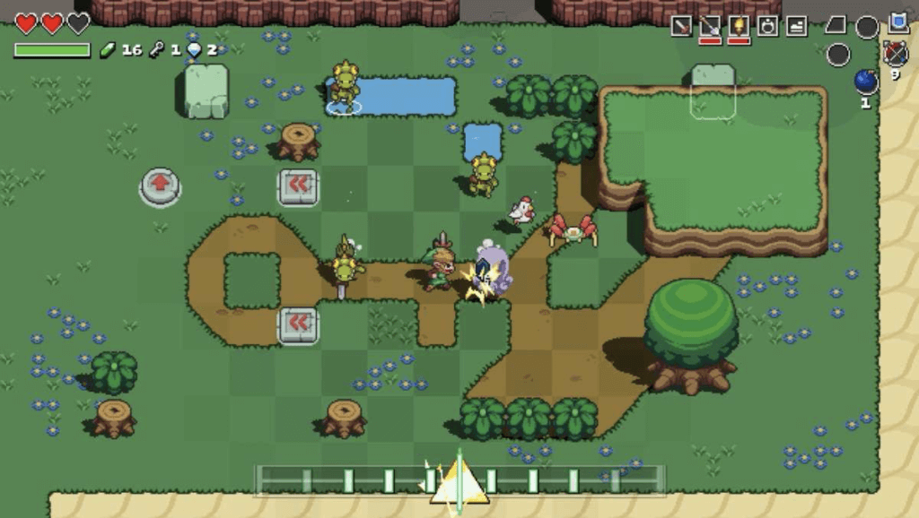
Cadence of Hyrule – Crypt of the NecroDancer (2019) by Brace Yourself Games.
Notice the “beat meter” (at the bottom) that sets the pace of the gameplay.
Of course, a user interface can also include elements like in-game menus and, as it’s the case with multiplayer games, chat windows, scoreboards and player indicators.
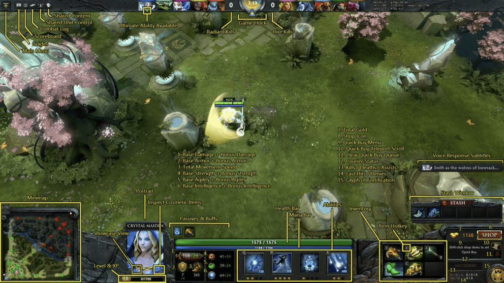
Dota 2 (2013) UI layout by Valve Corporation via Dota 2 Wiki(1)
Many of the UI concepts that originated in games have been widely adopted by utility software, including modern productivity and collaboration tools.
Elements like the online “green dot,” progress bars, or the multiplayer indicator we covered in our previous article have deep roots in game design.
One example of a tool that makes good use of those mechanics is Figma. Geared toward creatives and design teams, Figma is branded as the “all-in-one design tool.”
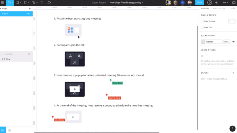
Figma’s multiplayer workflow by Figma
But Figma’s frictionless user interface is an exception rather than the norm. Most modern productivity and collaboration tools fail to balance functionality and aesthetics in such a way that the final product not only looks good but also does what it’s supposed to.
Luckily, the game industry can help fix that.
Ever since William Higinbotham’s Tennis for Two (1958), developers have been refining UI design to give players the most frictionless experience. Considering that the game industry is expected to cross a $200 billion mark by 2023, it looks like they know what they’re doing.(2)
The commercial success of the global game industry poses a few interesting questions:
- 🔥 What aspects of UI design make games so compelling?
- 💡 What can software developers learn from them?
- 📥 Is it possible to implement those attributes in productivity tools?
So, for the purpose of this article, we’ll focus on three qualities that’ll help us recognize and assess some of the best UI design practices in the wild: ⭐️ User Engagement (retention rate + satisfaction), 🎮 Usability (features + ease of use), 👾 Aesthetics (immersion + customization).
Let’s start by finding some role models. 🔍
🏅 Games With Great User Interface
Red Dead Redemption 2 (2018) by Rockstar Games
“If you find yourself in a hole, the first thing to do is to stop digging.”
John Marston, Red Dead Redemption 2
The most recent addition to Rockstar’s lineup, Red Dead Redemption 2 throws players into the mud and blood of the Wild West gunslinger life. Set on a vast territory resembling the 19th century U.S., RDR2 boasts a vivid, open-world design and an impressive level of detail.
To crank up the immersion and add to the realism, the game comes with a robust, frictionless user interface that ticks all the boxes of user engagement, usability and aesthetics.
- ▶️ It’s contextual and changes depending on players’ actions
- 🔡 Can be scaled up, down or turned off completely
- 🔤 Has color-coded dialogue lines for different characters
- ℹ️ Includes accessibility features for players with color blindness
- 🎦 Matches the visual flavor of the period (textures, color palette)
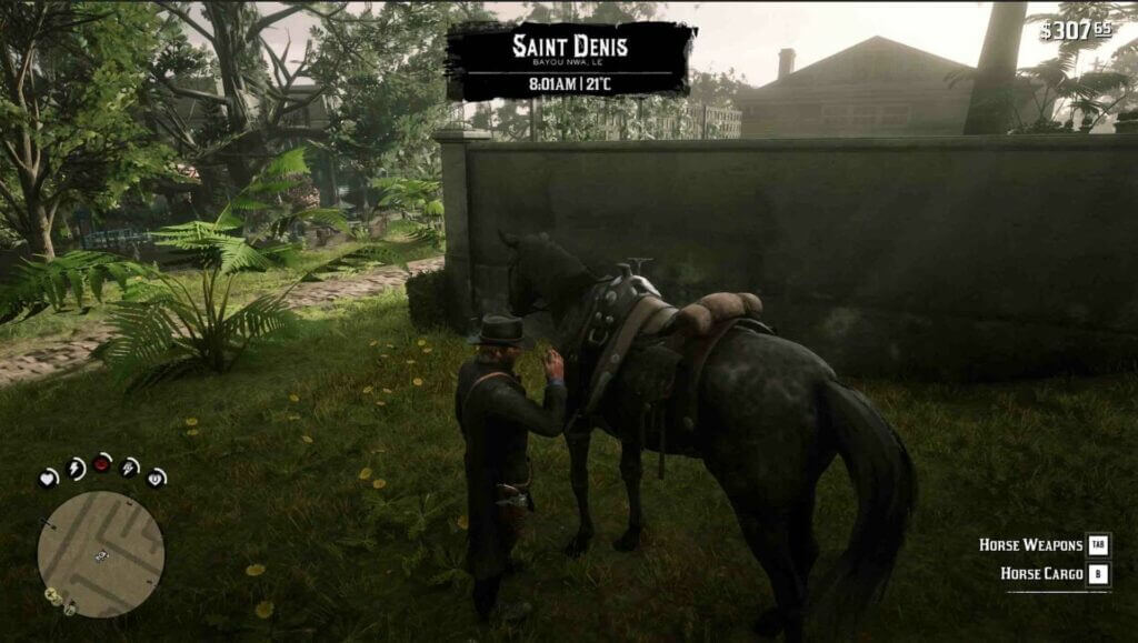
Red Dead Redemption 2 user interface by Rockstar Games via Reddit.
Notice the contextual menu at the bottom right
While some players point out that the RDR2 UI isn’t action-oriented enough and lacks the dynamic expected in the genre, the design choices are anything but accidental.
As one Reddit player observes:
“RDR2 has a strong emphasis on exploration. The world given wasn’t meant to be rushed, but thoroughly immersive, where you want to look at every nook and cranny for hidden secrets, caches, and people.”
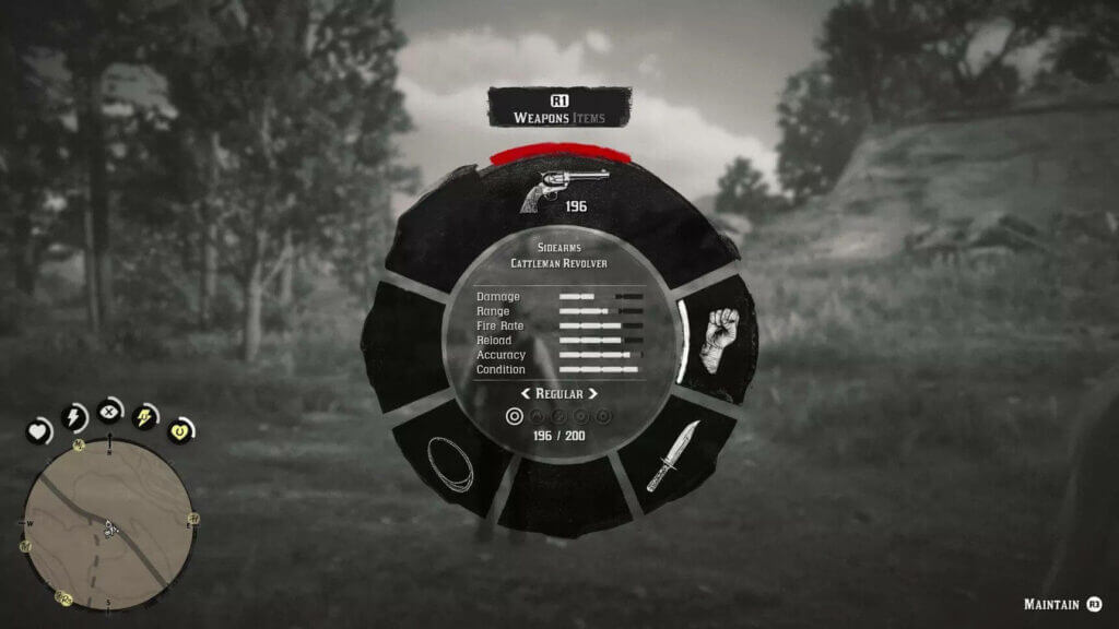
Red Dead Redemption 2 weapon wheel by Rockstar Games via Polygon(1)
On the one hand, the game’s user interface is minimalist enough to allow maximum immersion in the virtual world. On the other, it lets players decide how much information and in what form they want on the screen.
Dead Space (2008) by EA Redwood Shores
“Isaac, no! This is a really bad idea!”
Ellie Langford and Isaac Clarke, Dead Space 2
“Stick around. I’m full of bad ideas.”
Set aboard a deep-space mining vessel USG Ishimura, Dead Space puts players (as an engineer Isaac Clarke) in the middle of an emergency mission gone wrong.
A representative of the survival horror genre, the game received numerous awards, including a BAFTA Games Award for Audio Achievement and GameSpot Award for Best Atmosphere.
Traditionally, games use what’s known as a HUD (heads-up display) to lay out key information on the screen. This type of UI design, called non-diegetic representation, completely separates interface elements from the game world.
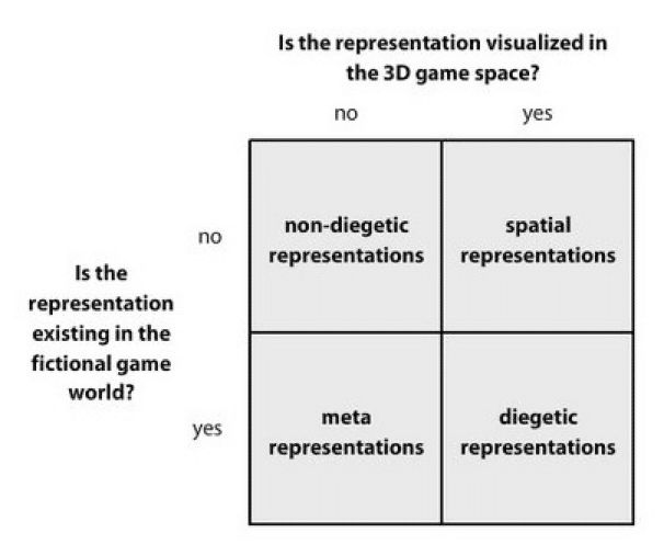
UI representations by Fagerholt & Lorentzon via Gamasutra(2)
When Dead Space was released back in 2008, its user interface was like no other game before it. Instead of relying on on-screen elements, developers opted for a diegetic design and made the UI an integral part of the game world.
Here’s a small presentation. 👇
In a 2013 interview, Dino Ignacio, who was then acting as the Dead Space UI lead at Electronic Arts said that effective UI design in games combines functionality with aesthetics:
“There is a definite need to give the design some character and embellishment. It needs to help guide the user into the game but there are also real functional requirements. In a game like Dead Space, we have sci-fi embellishments and ornamentation but above all that we have the functional layer of actual UI.”
Although Dead Space breaks with a whole lot of design conventions, it still manages to keep user engagement, usability and aesthetics high.
⚡️ How Can Game Design Make Productivity Tools Better?
1. User Engagement
User engagement may not seem like a big deal in productivity tools. After all, its singular purpose is to help teams and individuals get work done rather than have fun, right?
The thing is, a piece of software that doesn’t feed users a 🍪 once in a while will quickly end up on a pile of functional but otherwise mundane tools nobody wants to use.
Using a productivity tool that “just” works is as uninspiring as it gets
The cookie can be anything from an animated project progress bar or audiovisual feedback for checking items off a to-do list to little hints and prompts that guide users around. All these winks and nudges are what UX/UI designers call micro-interactions.

Stepped progress bar by Cassidy Williams
According to Dan Saffer, the author of Microinteractions: Designing with Details:
“Microinteractions are contained product moments that revolve around a single use case—they have one main task. Every time you change a setting, sync your data or devices, set an alarm, pick a password, log in, set a status message, or favorite or “like” something, you are engaging with a microinteraction.”
Game developers often use microinteractions to entertain players during loading time (minigames), add to the storyline (lore messages) or prompt certain actions (in-game hints).
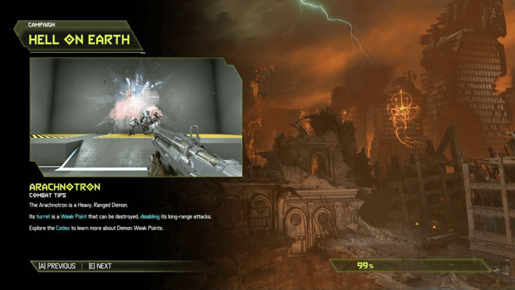
Doom Eternal (2020) loading screen by id Software. Notice the progress bar at the bottom right corner and gameplay tips on the left
Most people we don’t even register these experiences. They’re like ephemeral feedback that makes software, an inherently intangible thing, almost tactile and fun to use.

And that’s exactly what productivity tools need. Small incentives make users click, scroll, type and interact with the software in a frictionless way. When it comes to UI design, it’s the small details, like an animated toggle button, that make all the difference.
2. Usability
As defined by Jakob Nielsen, “usability is a quality attribute that assesses how easy user interfaces are to use. The word “usability” also refers to methods for improving ease-of-use during the design process.”
Since usability in itself is rather ambiguous and difficult to pin down, N&N suggests a set of five components that help frame and assess it across different types of software:
- 📚 Learnability. The learning curve for basic user actions
- 🏃♀️ Efficiency. Repeatability of the basic actions
- 🧠 Memorability. Relearning basic actions for returning users
- ❌ Errors. The type and magnitude of user errors
- 🍪 Satisfaction. Gratification for user actions
For instance, a glance at Microsoft’s latest installment of Flight Simulator makes one thing clear. It’s not an arcade-style chillout game for Sunday afternoons but a complex flight sim that targets aviation enthusiasts and people who know a thing or two about planes.
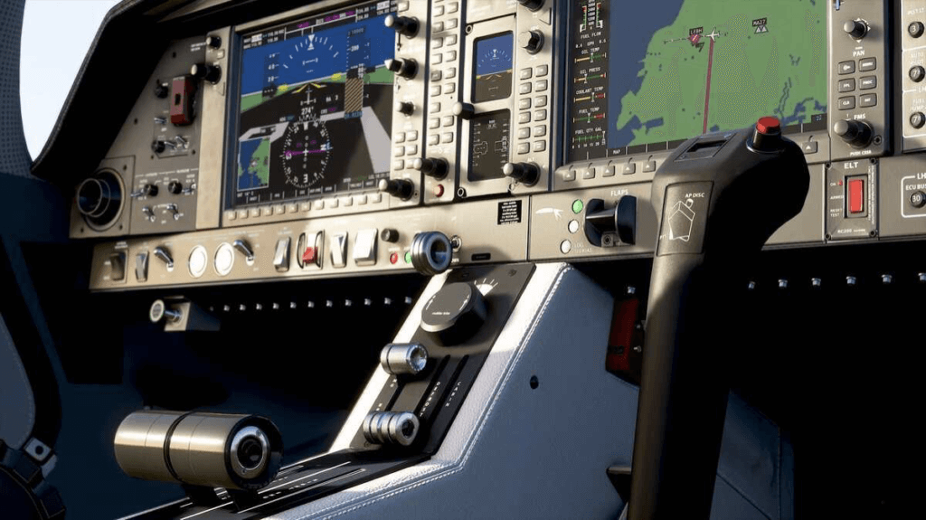
Plane cockpit interior in Microsoft Flight Simulator (2020) by Asobo Studio
But when we look beyond the intimidating controls, unforgiving realism and the sheer size (cries in gigabytes) of the game, it turns out the game scores surprisingly high on the usability scale.
To make the game more accessible to novice pilots, the developers created an extensive Flight Training component that covers elements like take-off, navigation and landing. On top of that, the game offers several “Assistance” options that simplify the gameplay even further.
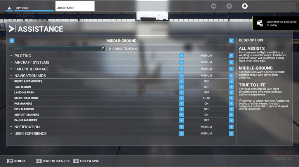
Microsoft Flight Simulator (2020) by Asobo Studio
All that earns Microsoft Flight Simulator solid notes on learnability and efficiency as well as memorability since it lets players scale down the requirements for performing basic actions. Variable difficulty makes the game more forgiving of errors and satisfying for casual players.
The lesson for today? 🤔

Push the Button by Emily Mills
UI design in productivity tools should accommodate both casual and power users. While some people may want some overhead for more complex tasks, others will appreciate a guided experience that gives them essential functionality without too many compromises.
3. Aesthetics
UI design choices in games are usually dictated by the storyline and genre conventions. For instance, while a survival horror may opt for a minimalist user interface for better immersion, a real-time strategy (RTS) calls for a more detailed output with key information always in view.
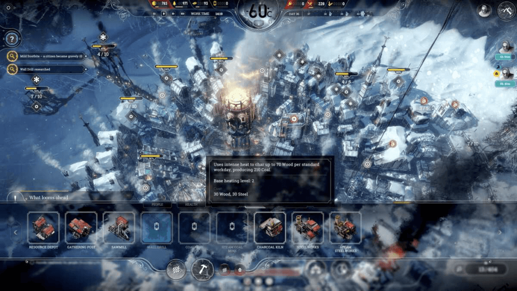
Frostpunk (2018) by 11 Bit Studios
Most of the time, UI design is a game of compromises between:
- 👁 Visual appeal. Minimalist, responsive and consistent
- ❤️ Immersion. Engaging but not getting in the way of the gameplay
- 🛠 Customization. Offering a limited amount of customization
Take, for example, ArenaNet’s Guild Wars. A classic example of an online role-playing game, Guild Wars uses a traditional UI layout that includes elements like a compass, chat window, energy/health/ bars and an experience meter.

Guild Wars UI components by ArenaNet via Guild Wars Wiki
Unlike in other representatives of the genre, the user interface is clean and minimalist. Instead of cluttering the entire screen, it gives players essential information and nothing else. The same is true for customization options that are limited to a handful of no-nonsense tweaks.
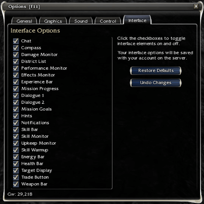
Guild Wars UI customization screen by ArenaNet via Guild Wars Wiki
UI design in games and utility software is like a three-pointed teeterboard with visual appeal, immersion and customization on each end:
- ⭐️ Too much customization can distract users and break the immersion
- ⭐️ Focusing only on the visual appeal can undercut core functionality
- ⭐️ Immersion (functionality) should work in tandem with visual appeal
The goal is to keep those elements in a state of perfect balance so none of the three gets an upper hand. Only then can users get the most even and complete experience.
4. Replay Value
While the three qualities are all important on their own, their ultimate goal is to drive what players and game developers call replay value or replayability.
In simple terms, if a game offers players an incentive/reward to play more than once, it means it does have (high/low) replay value, read: it’s money well spent.
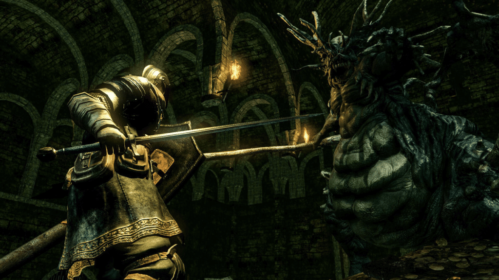
DARK SOULS™: REMASTERED by QLOC via Steam,
an action role-playing with high replay value
Traditionally, there are several elements that can increase replayability:
- 🔎 Exploring the story from new angles
- ⭐️ Finding hidden rewards and new challenges
- 💨 Playing in an open world without any boundaries
- 👥 Playing as a different class/character
- 🎰 Beating the high score
- 🎲 Generating randomized worlds with infinite possibilities
- 🔥 Increasing the difficulty level
- ⚔️ Competitive multiplayer mode
Of course, the same mechanics can be applied to productivity tools. For instance, why not dramatize “productivity” as a real-life RPG (role-playing game) with habits instead of skills and new challenges each week to crank up the difficulty level.
Sure, checking items off to-do lists and tackling projects probably won’t give you the “your princess is in another castle” 🍄 type of plot twists. But productivity tools can (and should) reward you as a user/player and give the incentive to come back for more.
And that’s it!
Till next time! 🐑

🔗 Resources
- https://dota2.gamepedia.com/Head-up_display
- https://techcrunch.com/2020/06/26/newzoo-forecasts-2020-global-games-industry-will-reach-159-billion/
- https://www.polygon.com/red-dead-redemption-2-rdr2-guide/2018/11/14/18087800/guns-weapons-explained-capacity-stats-gunsmith-modifications-favored-weapon-ranking
- https://www.gamasutra.com/view/feature/4286/game_ui_discoveries_what_players_.php?print=1


 The History of Keyboard Shortcuts: A Hidden Superpower for Productivity
  Personal Knowledge Management (PKM) | Organize Your Work and Life
  Ethical Anti-Design: The Road to No-Nonsense Productivity
  Seeking Balance and Tranquility: How to Manage and Beat Distractions at Home
  Creativity and Originality Fuels Productivity
  The Re-Birth Of Remote Team Productivity